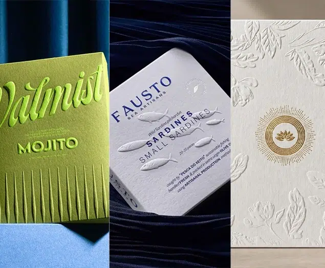


Top 10 Creative Beverage Packaging Designs (Containers & Illustrations) 2023 | Best Drinking Packaging Ideas
Beverages are almost a daily necessity for most people, and their packaging style is also very diverse and creative. Through the use of fashionable color matching and illustration elements, the product has a strong visual expression, and it is easier to attract the attention of consumers in terms of shelf terminal sales. In this packaging guide, we’ve compiled 10 of the most creative beverage packaging designs to help you get inspired when creating your own competitive packaging!
Top 10 Creative Beverage Packaging Designs 2023
As far as the beverage industry is concerned, cans, plastic bottles, glass bottles, Tetra Pak are common packaging materials, in order to cater to the current concept of energy conservation and environmental protection, beverage packaging in addition to creativity, the choice of materials has also become the key to the success of beverage packaging design. So how can creative beverage packaging design attract consumers and allow users to actively communicate for the brand? Take a look at these memorable beverage packaging designs, including container and illustration ideas.
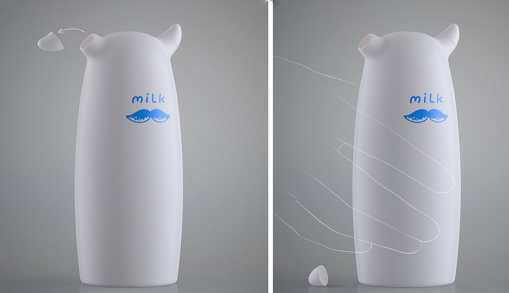
- Dmitry Patsukevich’s simple, creative milk packaging
Dmitry Patsukuvich is a New Zealand designer specializing in packaging design and industrial design, two of which are milk drink concept packaging designs. The bottle shape of Dmitry Patsukevich’s first milk packaging work is streamlined as the outer contour, and the horn is directly integrated into the bottle cap, which reflects the product industry attributes through the milk bottle shape alone, and has a strong visual identity. The bottle shape of Dmitry Patsukevich’s second milk packaging work is relatively conservative, but the splashing milk shape is integrated into the bottle cap in the design of the cap, which also creates a very recognizable outer packaging shape, and also has obvious visual differences from the packaging design of similar products. Through these two milk beverage packaging designs, it can be seen that the industrial shape of the bottle body is one of the design methods to create visual differentiation in the packaging design.
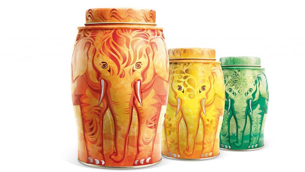
- Williamson Tea Super Vision IP tea beverage packaging
Williamson Tea is a centuries-old black tea brand from the UK, and the packaging design of the tea is made by the well-known British design team Springetts. Williamson Tea’s long history dates back to the Victorian era, and after more than 200 years of development and integration, its tea production area covers almost all the world’s high-quality tea-producing regions, while its overall visual system symbol retains the elephant image of the brand’s inception. The Springetts design team also retains the brand’s super visual symbol in the Williamson Tea new product packaging design, and at the same time, with a three-dimensional seamless splicing design method, the elephant image is perfectly integrated into the packaging design of the tea can, so that the Williamson Tea packaging design not only perfectly continues its visual identity symbol, but also has obvious visual differentiation and visual identity in the packaging design with similar competitors in the market.
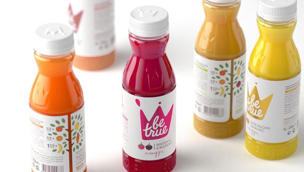
- Be true Juice Beverage Packaging
Be true is a well-known foreign juice beverage brand, the brand’s product packaging design is done by the Russian design agency Studioin. Studioin designed a new packaging bottle shape for the Be true juice beverage brand, making it more ergonomic and making the product more personalized, at the same time, in the bottle sticker design of Be true juice beverage Studioin breakthrough using masking paper material, and through different hot stamping colors to distinguish the taste of the drink, the junction of the bottle sticker adopts special-shaped cutting process and illustration combined with the shape of the fruit tree, the overall paper packaging design and similar products in the market have obvious visual differentiation. Laying a good foundation for the development of the brand, the packaging won the PentAwards 2014 Silver Award, known as the Oscar of packaging design.
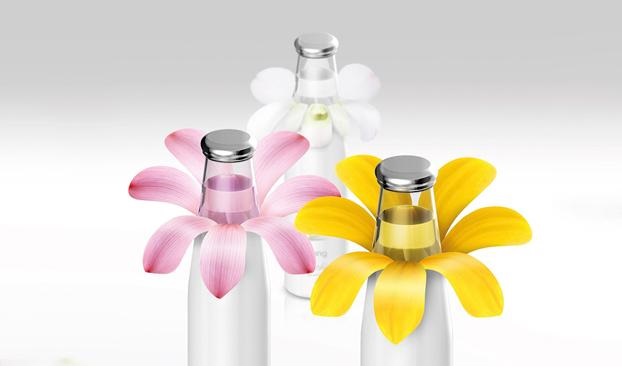
- B-ING FLOWER Drinking Packaging
Prompt Design is Thailand’s most well-known design team, and the influencer concept beverage brand B-ing is one of its masterpieces. The brand series of drinks have a total of four flavors are based on flowers as raw materials, the taste of the drink is fresh and natural, Prompt Design in the project bottle label packaging design creative use of double-sided printing technology, the outside of the bottle label to simple and clean white with bright petal elements presented, in the split bottle label, the bottle label inside the bright flower graphics are also presented, the overall bottle packaging design is like a blooming flower, with strong creativity and interaction, and the market similar competitors have obvious visual differentiation.
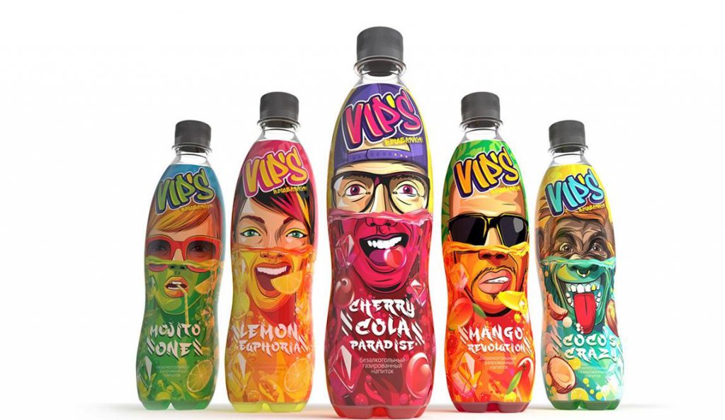
- VIP’s juice drink packaging
VIP’s non-alcoholic juice beverage packaging design was made by the Russian design team Ragordost, the juice drink has a total of five flavors, the main audience is young fashion teenagers. According to the preferences of the product audience, the Ragordost design team takes the free, unique and unique “graffiti-style” character illustration as the overall visual body of the package, and at the same time integrates the taste characteristics and characteristics of the beverage, shortening the distance between the consumer group and the product. The unique creative techniques and visual expressions have created a super visual symbol for the juice beverage packaging design, which is obviously differentiated from similar products in the market, providing a solid foundation for brand communication and product sales.
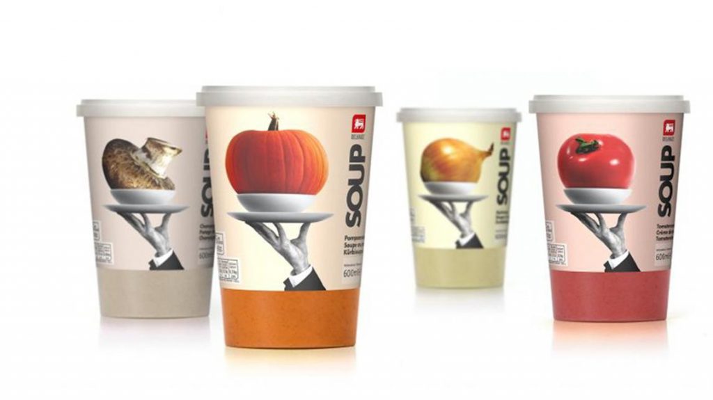
- SOUP vegetable juice packaging
Lavinia-Cienfuegos is a design team from Spain, they have a high position in the field of packaging design, of which SOUP vegetable and fruit food packaging design is one of its representative works. In the food packaging design, Lavinia-Cienfuegos takes photos of vegetables and fruits as the main graphics of the packaging design, and the image of high-end restaurant service staff is hidden in the packaging screen, forming a series of super visual images, the overall presentation of a strong postmodern visual style, unique creativity, and picture style with the market competitors have obvious differences, laying a solid foundation for the sales and brand communication of SOUP products.
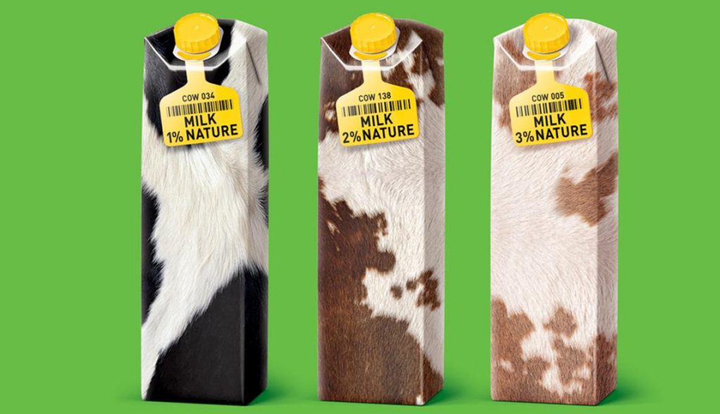
- MILK NATURE MILK BEVERAGE PACKAGING
Romanbelichenko is a famous design team from Russia, and MILK NATURE milk beverage packaging design is one of its most representative works. In the milk beverage packaging design, Romanbelichenko returns to the creativity itself, takes the cow’s skin pattern as the main visual element of the packaging, and creatively integrates the cow’s number label into the packaging screen as a carrier for brand and product information presentation, the unique creative perspective makes the image of the cow self-explanatory, and the market similar competing packaging design has obvious visual differences, perfectly reflects the core concept of MILK NATURE brand “pure milk is healthier”.
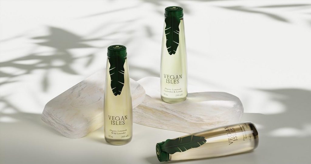
- Vegan Isles’ minimalist and high-end lemonade packaging
Vegan Isles is a lemonade inspired by the Bahamas. At present, there are countless lemonade drink brands on the market, and lemonade with fresh and healthy taste has always been loved by many consumers. How to stand out from the crowd of lemonade brands. Vegan Isles’ packaging design chooses a simple, elegant minimalist style. The bottle sticker packaging design does not use too many elements, only a tropical leaf-shaped label is designed on the bottle packaging, and the bottle cap uses the same color as the green leaf label to achieve visual unity, making people look like a bottle of drink sealed with green leaves. The label leaves extend downward to point to the text information at the bottom of the bottle body, using the shape of the leaves, the line of sight guidance planning, so that the consumer’s gaze shifts from the fresh leaf cap label to the text information on the bottle body, thus completing invisible guidance for consumers from curiosity to an in-depth understanding of the product.
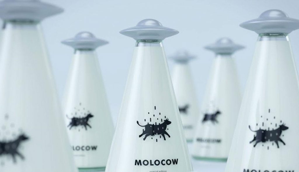
- Molocow sci-fi creative milk packaging
Molocow milk packaging design by Kyrgyzstan design team Imedia Creative Bureau, the milk packaging design idea is derived from the UFO alien legend of its milk origin, the shape of the bottle cap is designed as a UFO flying saucer shape, the bottle shape is inspired by the UFO light column, the theme graphic on the package – the cow is designed to be in a suspended state, perfect creativity, and interesting design execution make the package stand out.
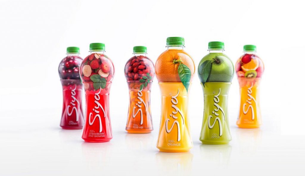
- Siya’s ingenious juice drink packaging
The packaging design of Siya juice drink is designed by Armenian Backbone Branding, the overall shape design of the lower part of the bottle is derived from the cup, and the lower part of the bottle is directly presented with the juice color in transparent form, and the overall shape of the upper part of the bottle body is directly derived from the fruit, and the fruit itself is directly presented by 3D shooting from various angles of various fruits. The overall design concept is obviously direct, reflecting the natural freshly squeezed taste of the juice, and the novel creative techniques and perfect expression make the packaging design win the PENTAWARDS Gold Award in the beverage category.

Top 10 Creative Cosmetic Packaging Design Ideas & illustrations 2023 | Luxury-Paper-Box.Com
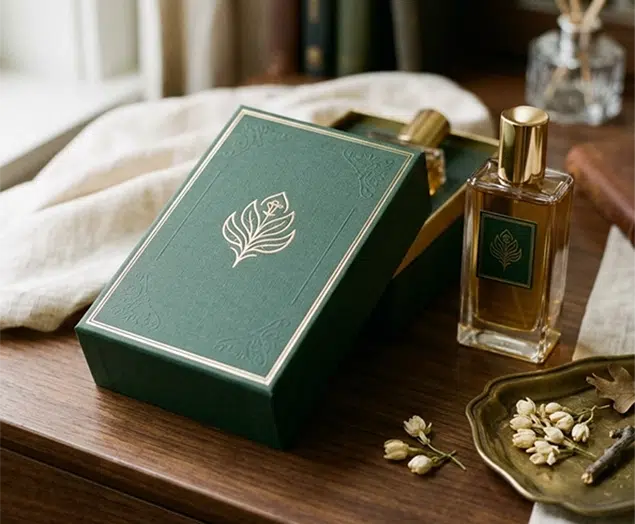
How the Right Perfume Packaging Sells the Scent
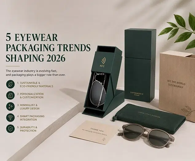
5 Eyewear Packaging Trends Shaping 2026