

Holiday Gift Boxes in 2026: What Seven Major Gifting Seasons Reveal About Packaging Design
Updated September 2026. Holiday packaging is no longer simply about changing a box from white to red, adding a ribbon, or printing a few seasonal icons. Across the European and North American consumer markets, some of the most interesting holiday packaging of 2026 is using structure, paper texture, illustration, finishing and material choice to communicate the occasion before the box is even opened.
Looking across seven major gifting seasons – Valentine’s Day, Easter, Mother’s Day, Father’s Day, Halloween, Hanukkah and Christmas – several recurring design signals are becoming visible.
Traditional holiday symbols have not disappeared. Hearts are still relevant on Valentine’s Day, blue and gold remain important for Hanukkah, and Christmas packaging still embraces familiar festive cues. What is changing is how those signals are expressed.
Instead of relying entirely on printed decoration, brands are increasingly turning to shaped paper boxes, natural fiber textures, selective metallic finishes, custom illustration and packaging designed to remain useful after the holiday.
Valentine’s Day: Romance Moves Beyond a Single Visual Formula
Valentine’s Day remains one of the strongest occasions for dedicated gift-box design, but 2026 shows that romance can be communicated in very different ways.
Laduree’s 2026 Valentine collection, Amour de Paris, uses custom illustration to turn Paris into a playful romantic world. Instead of relying only on repeating hearts or a conventional red-and-pink pattern, the artwork combines the Eiffel Tower, floating hearts and whimsical characters into a visual language developed specifically for the seasonal collection.
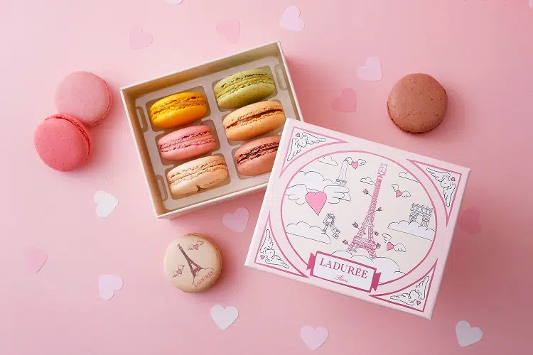
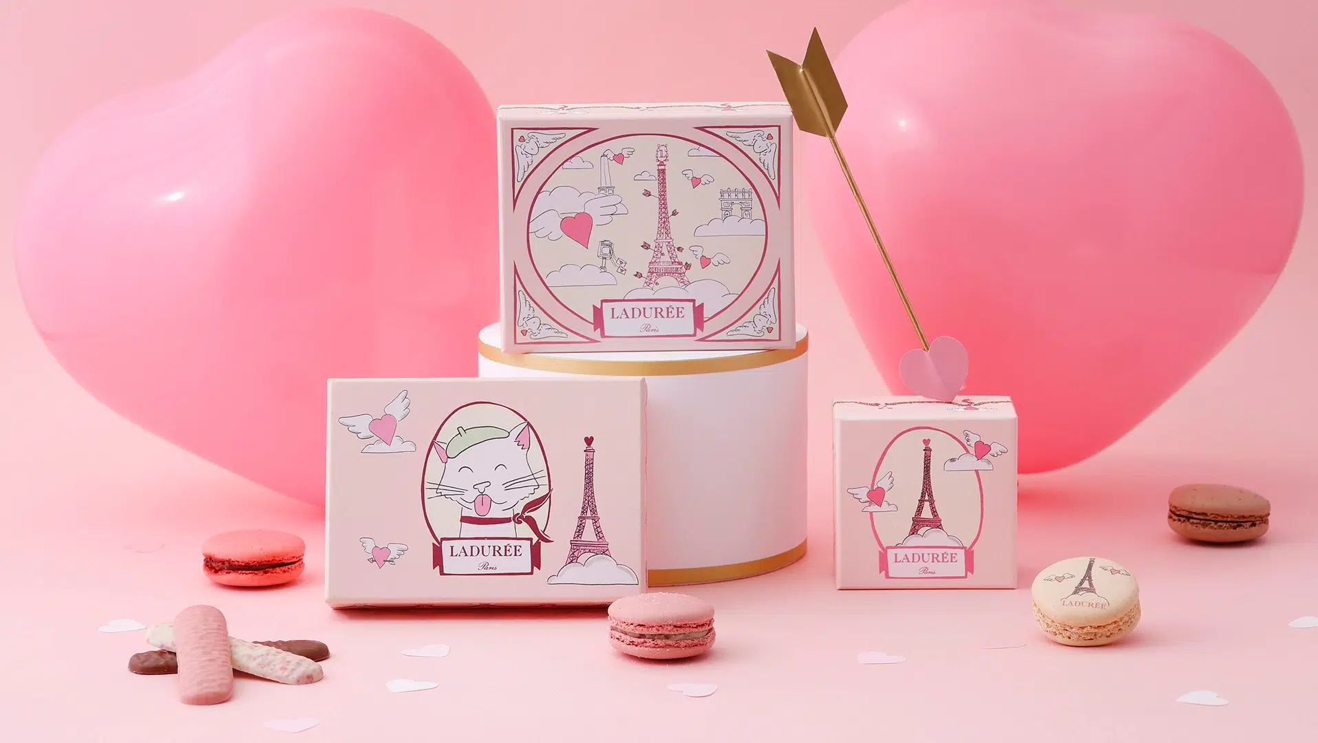
This is a useful example of illustration-led seasonal design. The box itself can remain relatively conventional while the artwork creates an emotional environment that feels specific to the holiday and recognizable as part of the brand.
GODIVA takes almost the opposite route. Its Valentine’s packaging retains familiar romantic codes such as red, gold and the heart silhouette. Here, the structure itself becomes part of the message. The consumer recognizes the gifting occasion before reading any typography.
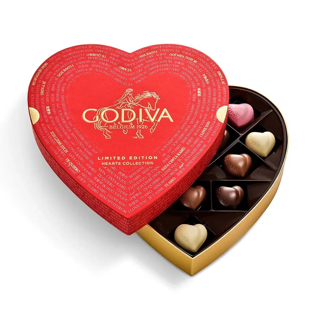
The lesson is not that traditional Valentine symbols are disappearing. Instead, brands have more ways to use them. A heart can become the box itself, or a conventional box can become romantic through illustration, color and finishing.
2026 Design Signals
Easter: Material and Structure Become Part of the Celebration
Among the gifting seasons examined here, Easter is one of the most experimental in terms of paper packaging. In the European market especially, brands frequently redesign not only graphics but also the physical form and material of the package.
Hotel Chocolat provides one of the clearest examples. Its Extra-Thick Easter Egg uses a molded paper pulp shell inspired by the shape of a cacao pod, while cacao bean husks are incorporated into parts of the paper packaging.
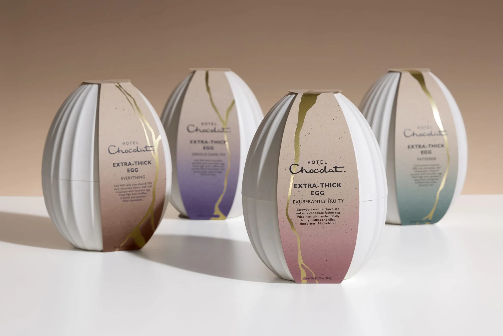
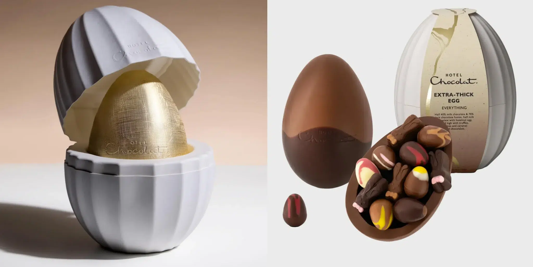
This is important for premium fiber packaging. Molded pulp does not need to be hidden behind printed board or treated purely as protective packaging. Its formed geometry and visible natural texture can become part of the premium presentation.
Neuhaus approaches Easter from another direction with its Easter House Box. Rather than making the package look like an egg, the brand turns the entire box into a small illustrated spring house.
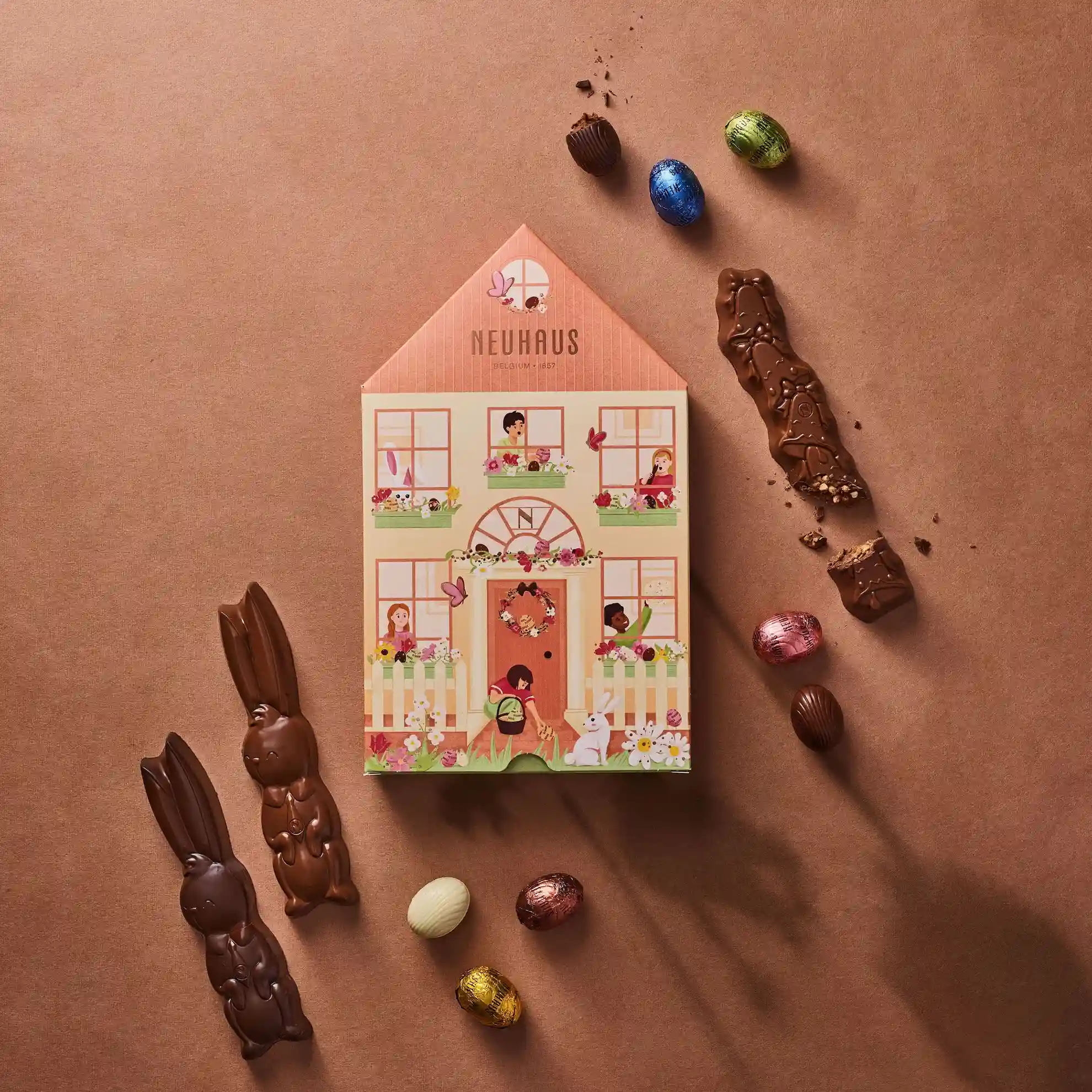
The architectural silhouette carries much of the seasonal message before the consumer even looks closely at the illustration. This is a recurring principle in 2026: structure can replace some of the work traditionally performed by printed holiday symbols.
For brands developing premium holiday gift boxes, Easter is a useful reminder that material selection, molded fiber and structural form can be as important as surface decoration.
2026 Design Signals
Mother’s Day: Florals Become Bolder and More Material-Led
Flowers remain one of the strongest visual codes for Mother’s Day, but 2026 demonstrates that floral packaging does not have to mean pale watercolor flowers on a soft pink box.
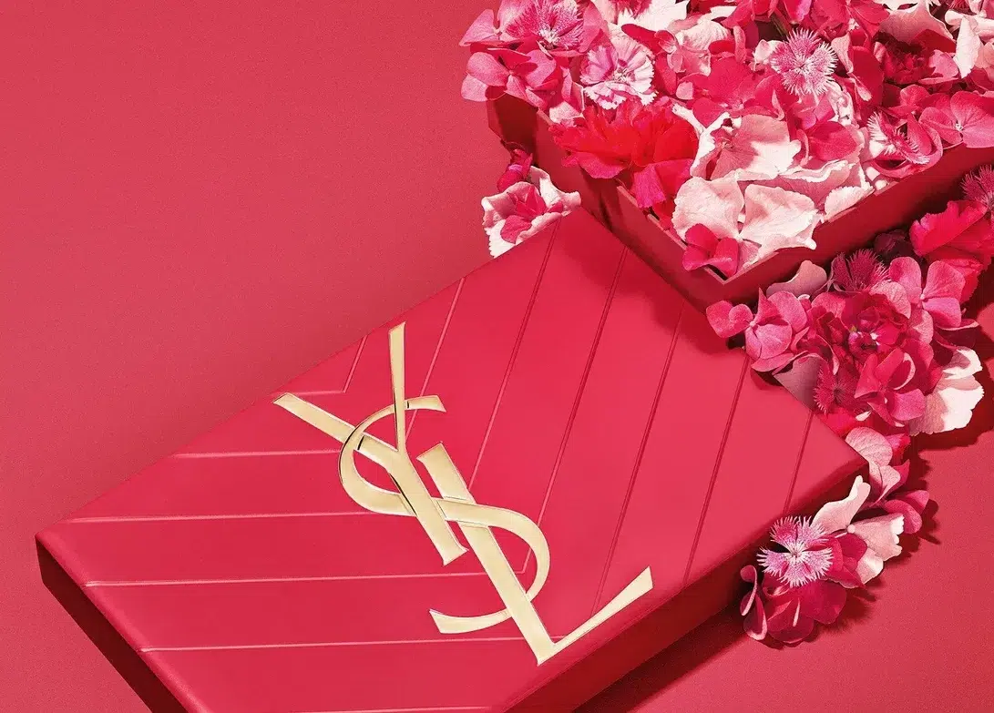
YSL Beauty takes a more fashion-led approach. Its Mother’s Day packaging uses an intense berry tone combined with the brand’s recognizable gold Cassandre identity. Rather than relying on delicate pastel packaging, the box translates the emotion of flowers through stronger color saturation and luxury branding.
Lush takes a more material-led route. Its Mother’s Day packaging combines recycled board and recycled or upcycled materials with expressive floral graphics, proving that environmentally conscious paper packaging does not need to adopt a muted kraft appearance.
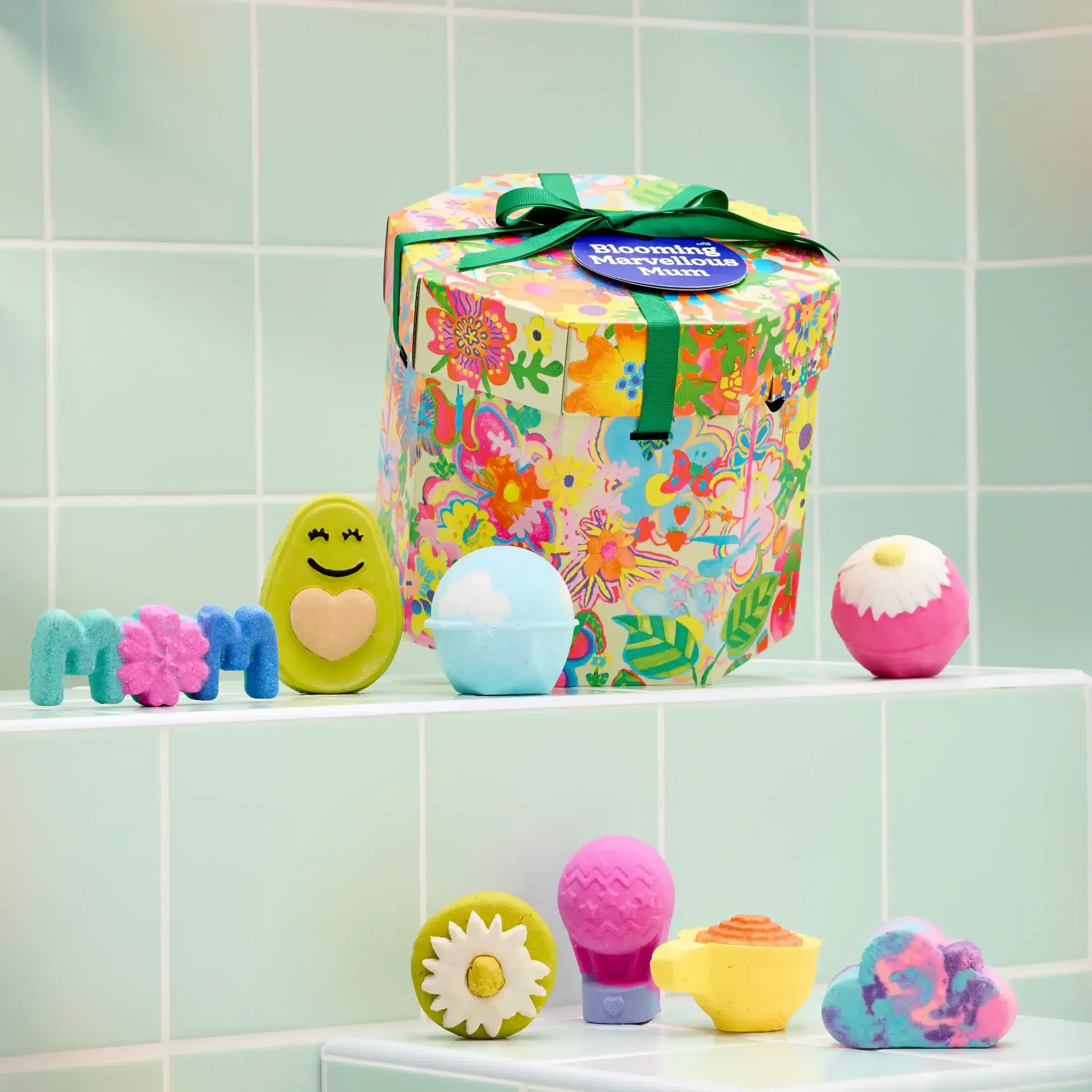
The contrast between YSL Beauty and Lush is particularly useful. One uses strong luxury branding and saturated color, while the other lets illustration and material choice become part of the story. Both still communicate celebration without falling back on a single Mother’s Day formula.
2026 Design Signals
Father’s Day: Familiar Structures, Stronger Graphic Personalities
Father’s Day behaves differently from Valentine’s Day or Halloween. There is no single shape or color that immediately defines the occasion, so many brands retain existing box structures and create seasonal identity through graphics, typography, sleeves and accessories.
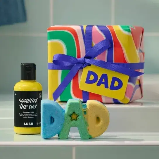
Lush’s 2026 Dad Gift is an unusually colorful example. The package combines energetic orange, yellow and green graphics with a contrasting blue or purple ribbon and a bold DAD tag.
See’s Candies demonstrates an even simpler production strategy. Rather than redesigning the entire structure, the brand transforms a conventional rectangular chocolate box into a Father’s Day product through a printed “GRT DAD” license-plate concept.
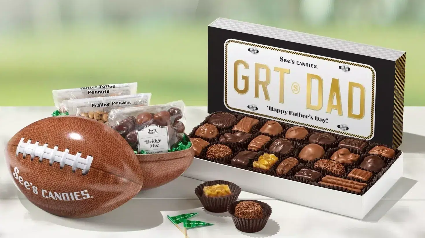
This is a useful reminder for packaging buyers. Not every holiday needs a new die-cut structure. When an existing box already works well, a new paper wrap, sleeve, label, tag or graphic concept can deliver enough seasonal differentiation while keeping production more efficient.
2026 Design Signals
Halloween: Let the Silhouette Do the Scaring
Halloween may not have the same gifting scale as Christmas, but from a packaging-design perspective it offers brands considerably more freedom to experiment with silhouette, illustration and theatrical presentation.
L.A. Burdick’s 2026 Coffin Assortment is one of the clearest examples. Instead of relying on a predictable bright orange-and-black palette, the coffin-shaped paper package uses midnight blue, cream-colored ghosts, stars and whimsical night-sky illustration.
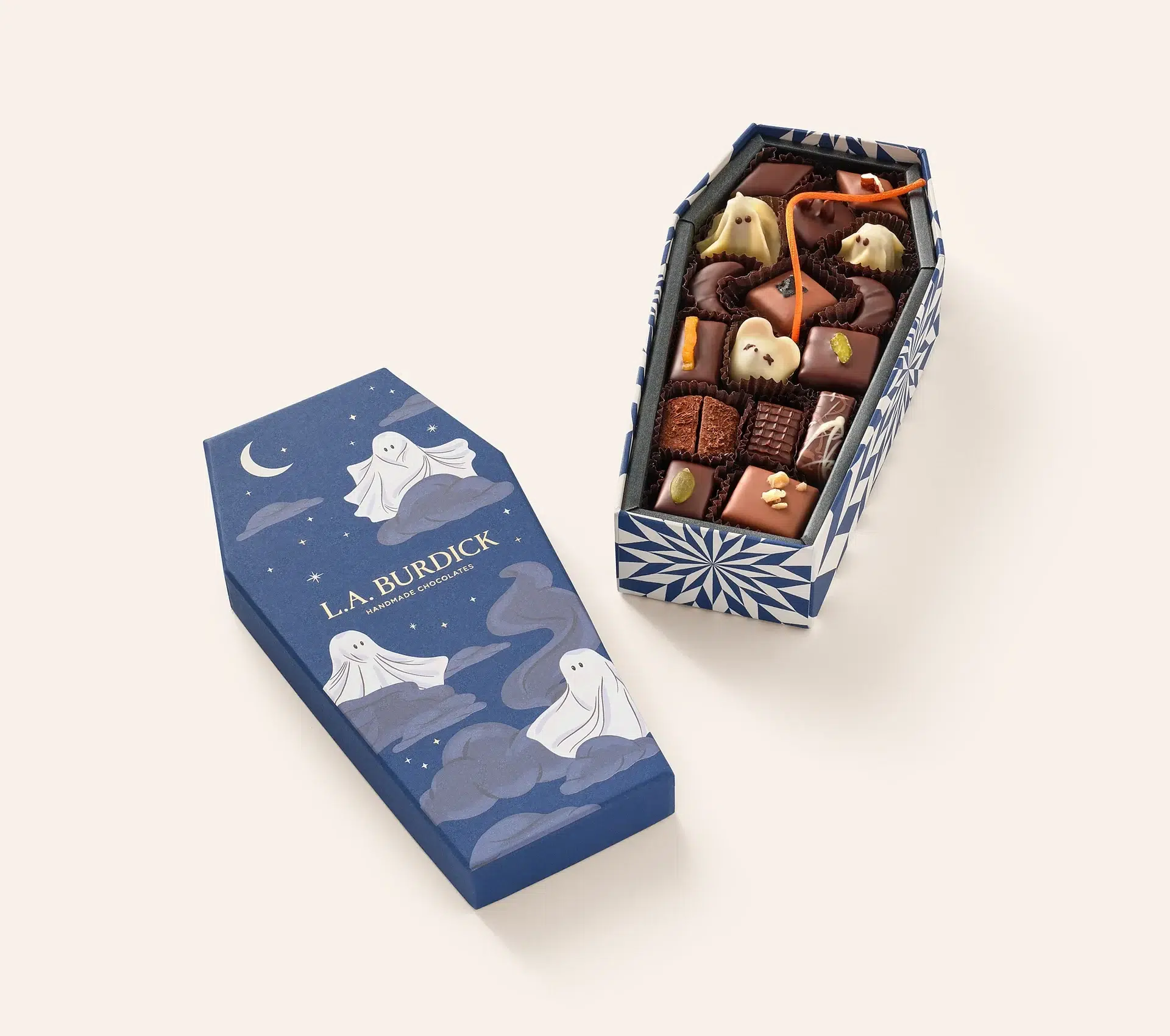
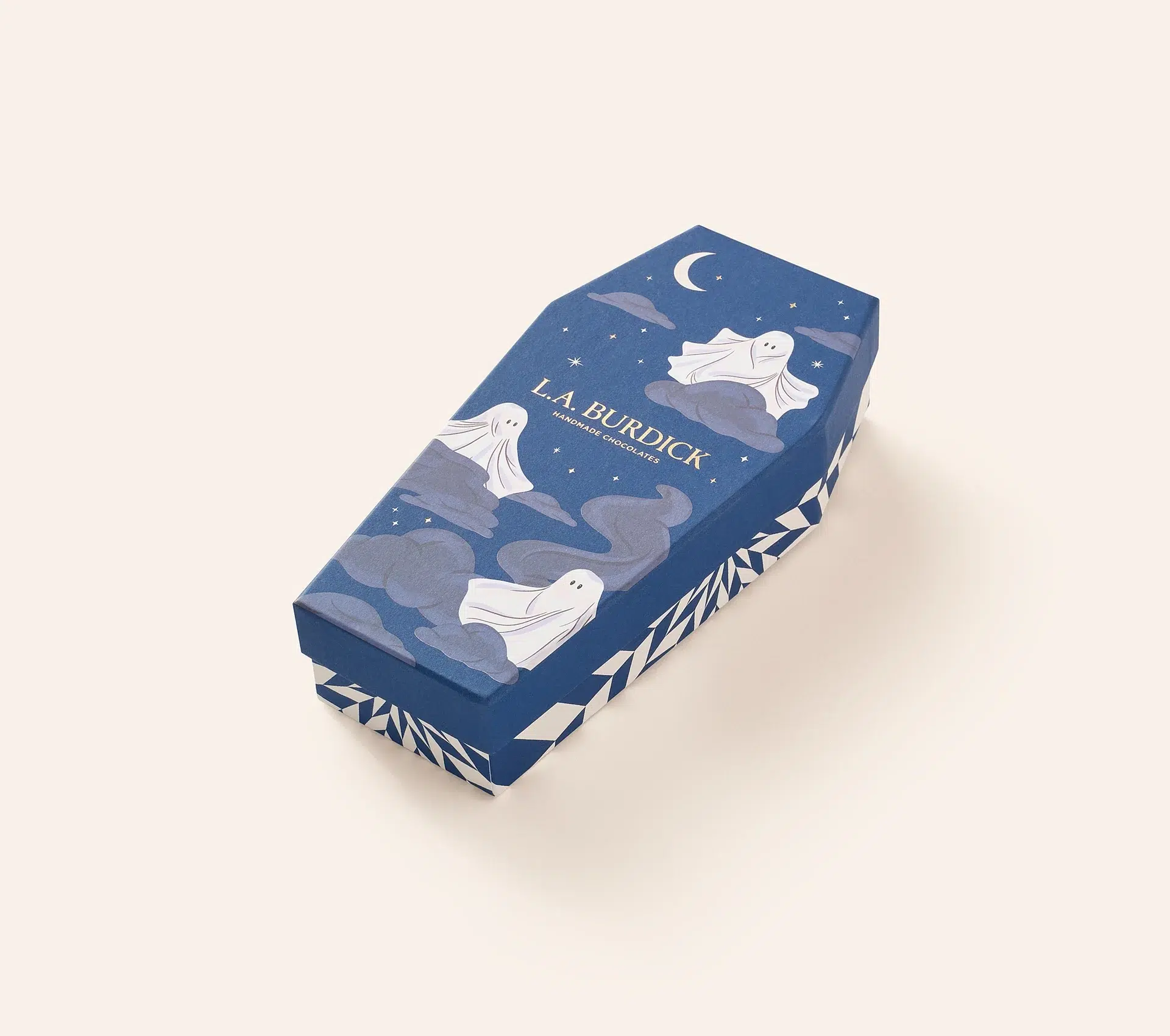
The coffin silhouette already communicates Halloween, allowing the illustration to become more playful and editorial instead of carrying the entire seasonal message.
Hotel Chocolat takes a different approach with its Boo Boxes. Pumpkin, vampire and bat characters become compact paper gift packages, combining character design with recognizable seasonal silhouettes.
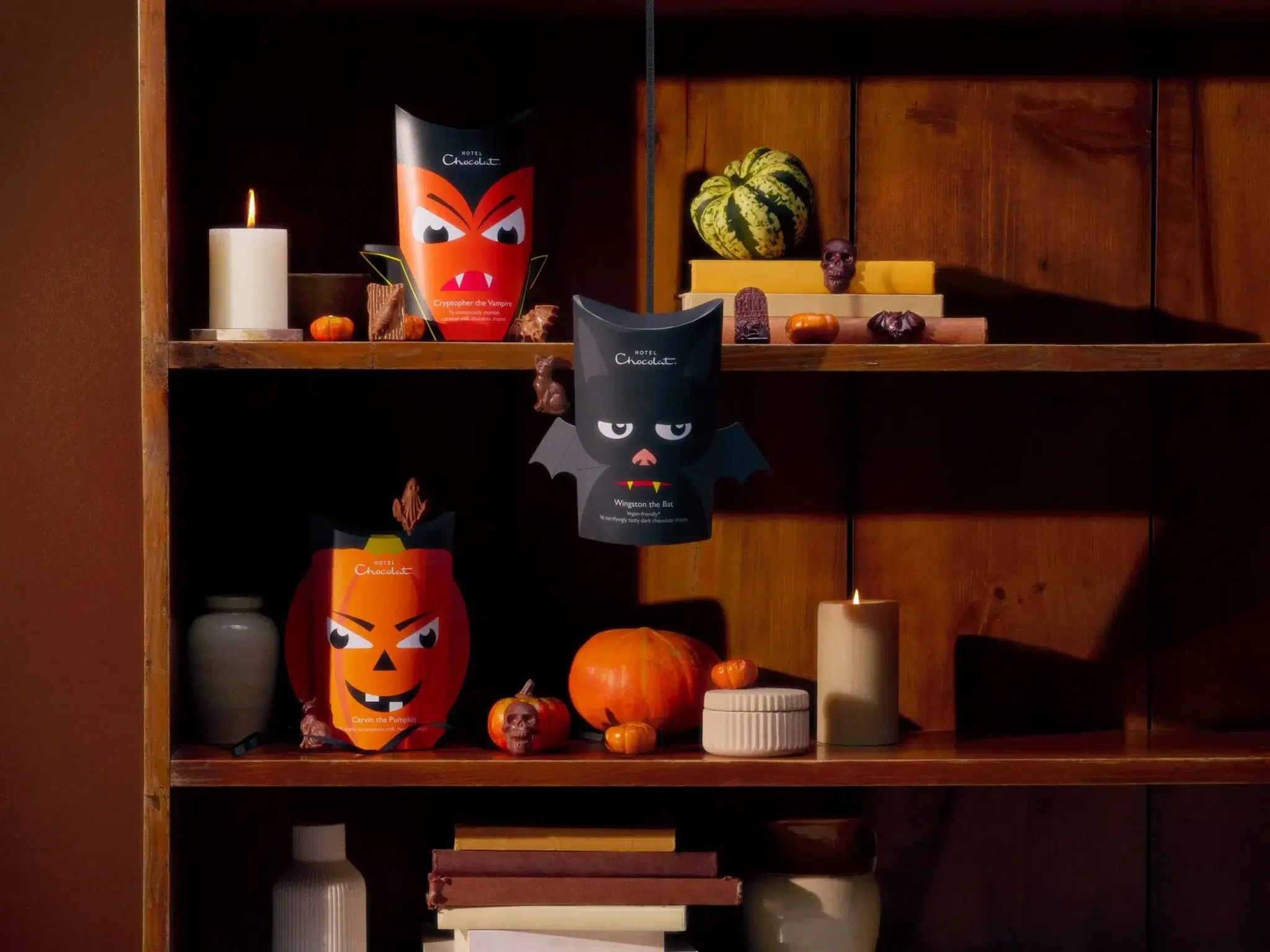
The contrast reveals two viable Halloween directions: one is darker, illustrated and editorial; the other is bright, playful and character-led. Both depend heavily on package form.
2026 Design Signals
Hanukkah: Familiar Color Codes, More Distinctive Structures
Hanukkah demonstrates that packaging innovation does not require abandoning recognizable cultural design codes. Blue, gold and silver remain effective, but brands can differentiate through shape, illustration and smaller tactile details.
See’s Candies makes structure the main feature of its Dreidel Box. Instead of simply printing a dreidel on a rectangular package, the entire paper gift box adopts the recognizable silhouette.
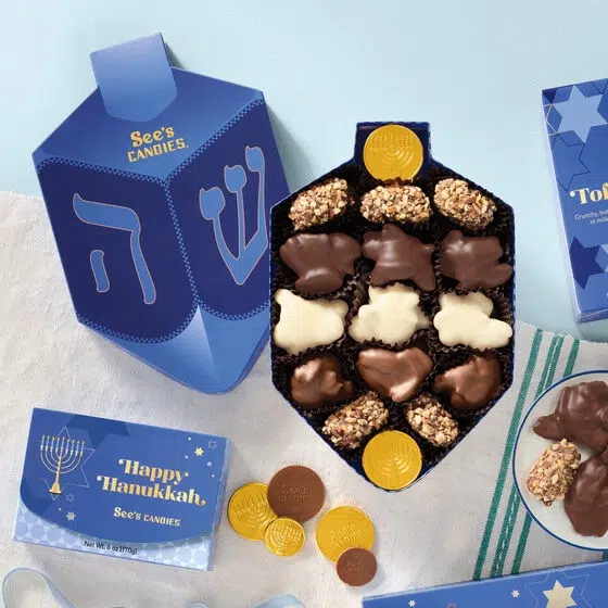
Compartes retains a more conventional rectangular format but creates a stronger surface identity through deep blue marbled graphics and a large gold menorah.
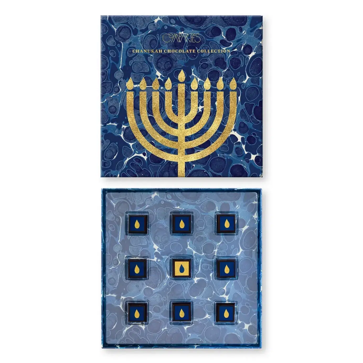
These two approaches demonstrate different levels of seasonal investment. One creates a completely new structural form, while the other uses an existing format and builds recognition through surface graphics and color.
2026 Design Signals
Christmas: Packaging Becomes a Display Object
Christmas remains the most technically ambitious seasonal packaging moment of the year. By September 2026, several premium brands have already revealed packaging that points toward one particularly strong direction: the luxury christmas gift box is increasingly expected to behave like an object rather than temporary packaging.
Liberty’s 2026 Beauty Advent Calendar turns illustration and structure into a collectible presentation. The exterior artwork continues across a large architectural form, while the interior is organized around multiple printed drawers.
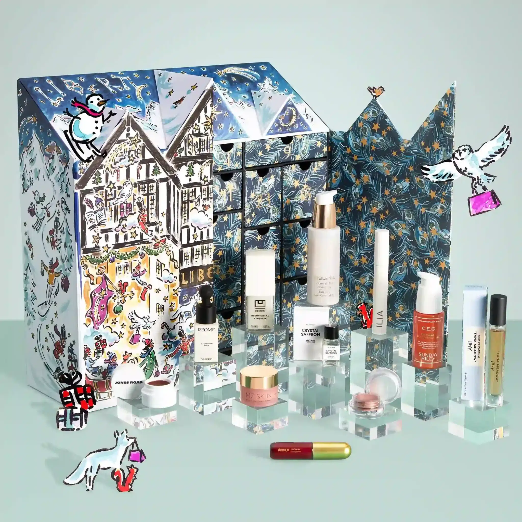
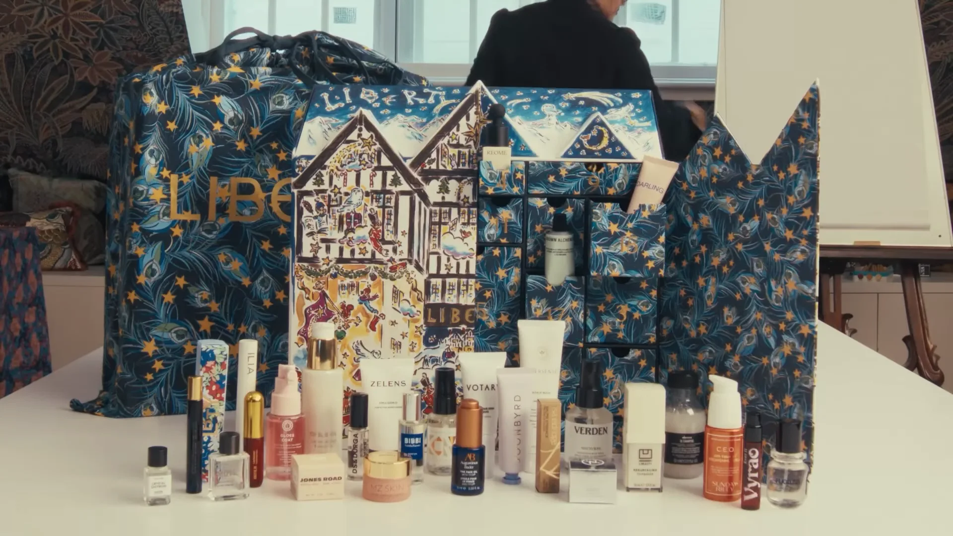
This kind of packaging sits somewhere between a rigid gift box, a storage object and a seasonal display piece. The consumer interacts with it repeatedly rather than opening and discarding it in a single moment.
Vosges Haut-Chocolat provides one of the most useful examples of surface finishing. Its 2026 Grand Cacao Advent Calendar combines a sturdy paperboard structure with copper foil accents, cream flocking, frosted windows and red satin ribbon.

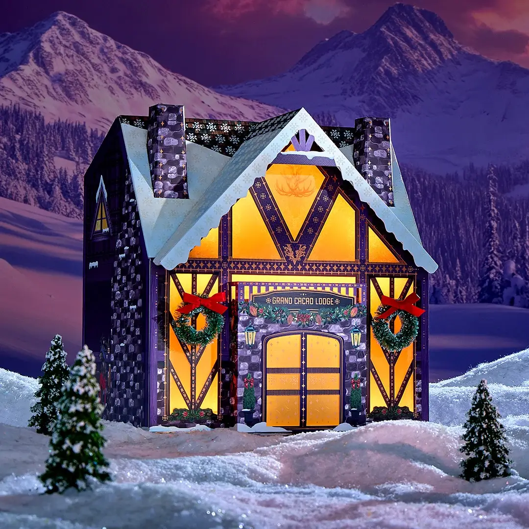
The flocked surface imitates snow through touch, while copper foil highlights architectural details instead of covering the entire package in metallic material.
This illustrates an important change in luxury Christmas packaging. Premium value increasingly comes from combining several physical sensations: rigid paperboard, soft flocking, metallic accents, transparent layers and textile details.
2026 Design Signals
What Seven Gifting Seasons Tell Us About Holiday Packaging in 2026
1. Structure Is Becoming a Seasonal Design Language
A heart, house, coffin, dreidel or architectural Advent calendar can communicate a holiday before the consumer reads a single word. Strong silhouettes allow brands to reduce unnecessary decorative graphics and let the package itself explain the occasion.
2. Holiday Colors Are Becoming More Flexible
Traditional color codes still matter, but they are no longer strict rules. Midnight blue can communicate Halloween. Berry tones can replace pale Mother’s Day pink. Easter can combine natural fiber neutrals with saturated spring colors. Christmas can move between copper, cream, illustration and familiar festive colors.
3. Custom Illustration Is Becoming More Editorial
Premium seasonal packaging increasingly uses illustration to create a complete world rather than repeating generic hearts, pumpkins, flowers or snowflakes. Illustration can also extend from the box into cards, bags, retail displays and digital campaign content.
4. Premium Finishing Is Becoming More Selective and Tactile
Metallic finishing remains relevant, but the strongest examples often use foil for logos, linework, borders and small highlights rather than covering the entire surface. At the same time, tactile elements such as molded fiber texture, flocking, ribbon and specialty paper are becoming more important.
5. Sustainable Materials Work Best When the Story Is Visible
A sustainability claim becomes more convincing when consumers can see and feel it. Hotel Chocolat’s molded pulp shell is immediately different from a conventional printed carton. Recycled board and alternative fiber papers can also remain visually expressive instead of being hidden behind another decorative layer.
6. Keepsake Value Is Becoming Part of Premium Gifting
This is most visible around Christmas, where drawer calendars and architectural rigid boxes increasingly resemble organizers, decorative objects and storage pieces. When the package has an obvious second life, reuse becomes part of perceived luxury rather than simply an environmental claim.
Designing Holiday Packaging for 2026 and Beyond
The strongest lesson from the year is not that brands need more complicated packaging. It is that every design element should have a clearer role.
If the structure already communicates Halloween, the surface does not need ten different Halloween icons. If a molded fiber shell already tells a strong material story, it does not need to be hidden behind an additional printed layer. If custom illustration creates a complete seasonal world, excessive finishing may add little.
If an existing premium rigid box already works well for the product, sometimes a carefully designed sleeve, ribbon, paper wrap or seasonal graphic system is enough.
The most useful question is not “What decorations should we add for this holiday?” It is “Which part of the packaging should carry the holiday idea – color, material, structure, finish or artwork?”
Once that decision is clear, even a relatively simple paper gift box can feel distinctive, premium and genuinely designed for the occasion.


Top 10 Creative Cosmetic Packaging Design Ideas & illustrations 2023 | Luxury-Paper-Box.Com
How the Right Perfume Packaging Sells the Scent
5 Eyewear Packaging Trends Shaping 2026