

Which Fonts To Choose For Your Custom Packaging Boxes?
As brands continue to recognize differentiation, packaging design has become a focus of brand marketing. As more and more brands join retail and e-commerce, packaging design can be said to be one of the best ways to make a product stand out. Packaging design contains many different elements, such as structure, text, patterns, colors, and so on. However, when many people are paying attention to structural design, patterns, and colors, fonts are often easily overlooked. But if you choose the right font and typesetting, you can help the brand design a unique product packaging.
Text Layout of Custom Packaging Box
In the design process, typography plays a key role in design and information transmission. It is an important part of creating a personalized brand and can shape the image of the brand in the minds of customers.
So what is the typesetting of custom packaging boxes? At the most basic level, typesetting refers to the technique of arranging text. The purpose is to make the text clear, easy to understand, and visually appealing in order to be attractive to customers. Typography occupies a very important position in packaging design because it can form a brand-specific impression in the minds of customers. When considering typesetting, you need to think about whether the text in the box can be easily understood by people and whether it can help customers make purchase decisions when shopping.
Font Type and Selection Of Custom Packaging Box
The fonts used in the packaging box are generally divided into two categories, one is a serif font, and the other is sans serif font. Serif font refers to the different thicknesses from the beginning to the end of the font strokes, with obvious strokes. This type of font is very delicate in appearance and highly decorative. For example, our most common Arial font belongs to the serif font. The opposite is true for sans serifs. The thickness of the murals of sans serifs is the same, and there is no stroke. For example, Microsoft Yahei belongs to sans serifs. Of course, different areas of the same packaging box can also use different font types. For example, the logo on the front of the box uses a sans serif, while the product description on the back of the box can use a serif. Avoid using multiple font types for the same area or the same information, which will make people feel confused and unprofessional in the visual sense.
When choosing a font for your packaging box, we first consider the goals that the brand wants to achieve and your audience, etc. This will help narrow your choice of fonts and choose the font that best suits your brand.

Top 10 Creative Cosmetic Packaging Design Ideas & illustrations 2023 | Luxury-Paper-Box.Com
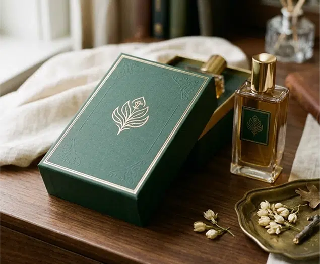
How the Right Perfume Packaging Sells the Scent
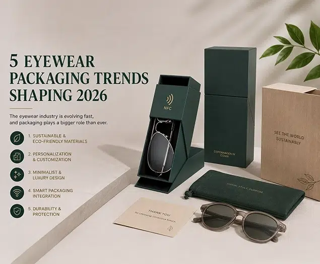
5 Eyewear Packaging Trends Shaping 2026