

Best Coffee Packaging Design 2023 – Top 4 Most Creative Coffee Packaging Design Ideas
In the face of increasingly savvy consumers, why do some coffee brands sell well and become popular; Some brands have been relegated to the cold, and few people are interested in them In addition to outstanding coffee quality, excellent packaging design must be a topic that cannot be bypassed. Successful coffee packaging, in addition to its high appearance, must have ideas and soul. A few extremely handsome and outstanding packaging products even have the opportunity to help the brand create a new category. Today, we would like to share with you the 4 best coffee packaging design for 2023. In addition to facial appearance, the philosophy and design ideas behind it may also be something we can learn from.
Best Coffee Packaging Design 2023 – Top 4 Most Creative Coffee Packaging Design Ideas
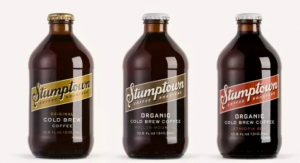
No.1 Stumptown X Cold Brew
Speaking of the hot Cold Brew in recent years, I have to mention this pioneering product from Stumptown Coffee Roasters in Portland, USA. Stumptown launched nitrogen ice brewed coffee in 2013. Adding nitrogen to ice brewed coffee can cause slight bubbles, which can taste like strong black beer covered with fresh milk bubbles. Once introduced, it is deeply loved by young consumer groups. There are various options such as bottled, canned, and carton packaging
The iconic dark brown glass jar is equipped with ground colors such as brown, burnt orange, and tan, which are very similar to the color of coffee beans under different baking degrees, and it implies that the selected coffee beans come from remote and mysterious coffee producing areas. In addition to classic bottling, there are also options for canned and carton packaging to meet consumers’ different purchasing preferences. Among them, Stumptown’s bottled style is very classic, known as “stub by” by Iron Powder.
Early designs mainly used two types of fonts, a serif font and a slightly slanted cursive script, both appearing on the main oval label. This design exudes a strong town atmosphere, with a strong affinity.
Later, the main purpose of the packaging redesign was to amplify the Stumptown brand name while retaining the spirit of the original packaging.
Such a unique and handsome design, coupled with a sweet and smooth flavor, has quickly made Cold Brew a brand new category and ranked among the top coffee brands; It has also quickly become a fashion pairing in popular American dramas and star street shots, which has played a good role in promoting the social dissemination of the brand.
Under such a trend, although many coffee brands have since followed the trend to launch their own Cold Brew products, they can more or less see the shadow of imitating Stumptown Cold Brew in design.
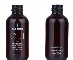
2.Blue Bottle Coffee X Oji Cold Drip
Iced coffee is the main product on many coffee shops’ summer menus. When it comes to packaging design, it’s important to mention Blue Bottle, a Japanese style iced coffee (Oji). This product won acclaim from the very beginning of its launch. The overall product packaging inherits the usual style of Blue Bottle, with a black matted bottle body and a signature blue bottle logo, maintaining a low profile and refinement as always.
In addition to eye-catching, it also uses a design texture that emphasizes the long extraction process of Iced Drop Coffee, its rich and powerful aroma, and its excellent sweet and mellow flavor. Whether you’re a fan of Iced Coffee or not, seeing this design can’t help but tempt you to try it out. P.S. Oji is compared to Rolls Royce in an ice drop coffee maker. Due to its time-consuming extraction process and pure taste, it has become a popular product for coffee lovers when they are cooling off.
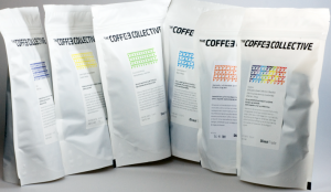
3.Coffee Collective
A few years ago, the first beans I bought in Denmark in Northern Europe were from the Coffee Collective family. The team behind Collective is composed of world champion teams such as the World Barista Champion and the World Cup Tasting Champion, and its strength cannot be underestimated. And its brand design also has many worthies of reference and references.
The brand’s ripe bean packaging design is very recognizable and of course very Scandinavian. Interestingly, each cooked bean has its own unique color style, and at first glance, it is deeply attracted by the packaging creativity.
Of course, the multi color design is not only for looking good but also for cleverly distinguishing different flavors of coffee beans with colors, making it convenient for consumers to choose. Collective launched its “transparent and visible bottom” design as early as 2011. Although it was just a small move, it was a small design, but it was extremely creative. Convenient for consumers to observe the condition of the coffee beans inside the bag through the bottom, to avoid opening the bag and causing damage to the coffee beans due to sunlight. The design of its vertical packaging was later emulated by many brands. (Excellent packaging, in addition to high appearance, the devil often hides in the details.)
In particular, the outer packaging of cooked beans is printed with the FOB price of raw beans, and The Coffee Collective is the first. In addition, the words “Direct Trade” can also be prominently seen at the bottom of the back of the package. These two details highlight the importance that the brand attaches to the source of raw coffee beans and the sense of responsibility to directly communicate and trade with coffee farmers. In the same sentence, consumers will be moved by the intentions of the product, thereby generating trust.
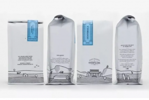
4. Esselon Café X Fresh New Look
Although Esselon Caf é is not as famous as the previous coffee brands, it was originally just a popular community coffee shop in the United States. However, in a brand upgrade planning, it has customized a new scheme for the packaging of cooked beans, and has received a lot of praise. This set of packaging is also very valuable for reference. The new packaging design uses bold line illustrations and color labels, with these lively and detailed elements jumping out of the overall white packaging bag to remind consumers of the origin of coffee; It has also successfully delivered a simple, refreshing, elegant, and exquisite new brand identity to people.
Good packaging does not necessarily have to take the route of being tall and upscale. It injects some familiar elements into the brand but rather irons the hearts of people.
The hand-painted patterns on this set of coffee packaging cleverly capture the local customs, such as the Seven Sisters Mountains, which is one of the most distinctive landscapes in the town; And the lovely farmland is also the most familiar scene of life. The strong breath of life comes to one’s face and is fascinating.
As expected by the brand team, if a good coffee shop is a place where local residents gather the most on a daily basis, then good coffee packaging should also make people feel more intimate.
If such packaging is displayed on the shelves of local supermarkets, even if there are large brands with high reputations, local people will definitely choose this group of brand packaging that they are familiar with and love. After all, sometimes, what you drink is not coffee, it’s life. Nowadays, there are various coffee brands on the market, and it is not easy to attract increasingly picky consumers the first time. Let’s take a deep heart and skillfully use packaging design to make excellent coffee brands popular.

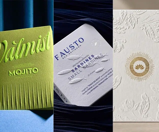
Top 10 Creative Cosmetic Packaging Design Ideas & illustrations 2023 | Luxury-Paper-Box.Com
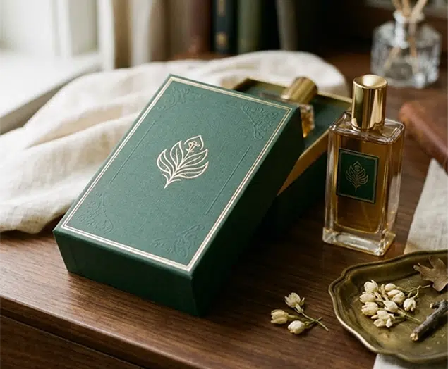
How the Right Perfume Packaging Sells the Scent
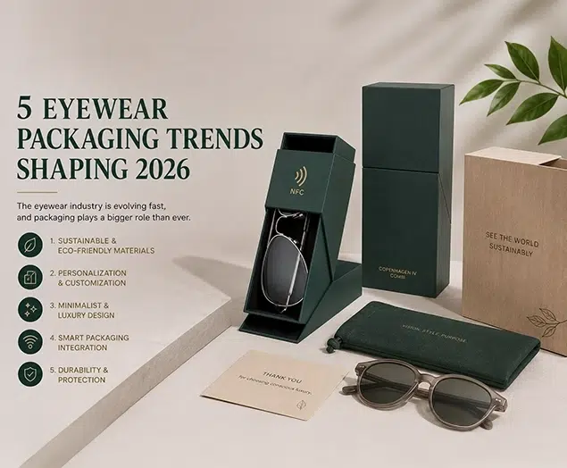
5 Eyewear Packaging Trends Shaping 2026