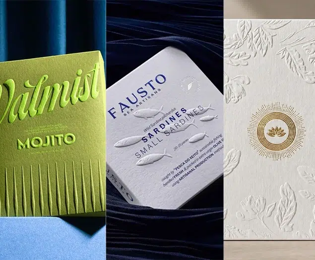


Top 10 Creative Food Packaging Design Ideas & Illustrations 2023 | Luxury-Paper-Box.Com
Packaging design can carry more creative landing points than print advertising design, and a good packaging design can help brand sales directly obtain greater sales on the consumer side. So, when talking about a product brand, custom packaging design is usually a very important angle. Among the many product packaging in the world, food packaging design usually encompasses many breathtaking creative inspirations. Here we share the Top 10 most innovative food packaging from all over the world.
Top 10 – Fun food dried fruit packaging design
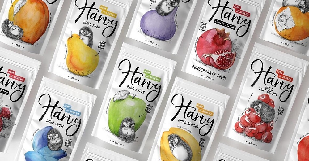
This group of packaging designs comes from the Formascope team studio in Armenia, and the design of the Formascope team is often based on the creative mining of the product itself, creating its own creative design style for the product. Harvy’s dried fruit has more than 10 flavors, and the biggest feature of the product itself is no additives, and no artificial flavor enhancers, how to express the concept of Harvy dried fruit is a problem that the formal scope team studio needs to solve. “Natural, fresh, interactive” is the main concept of this design, the design mainly revolves around the creative illustration design of “relaxed, comfortable, free and fun”, with the interesting interaction of colorful fruits with cute little hedgehogs without color line drawings, and then with handwritten text, not only strengthen the contrast and tension of the picture but also highlight the core concept of the product, as if the audience’s emotions are injected into it, follow the hedgehog to enjoy natural, fresh dried fruit.
Related Read: Top 10 Best Summer Perfumes for Women in 2024
Top 9 – Flour food packaging design full of history
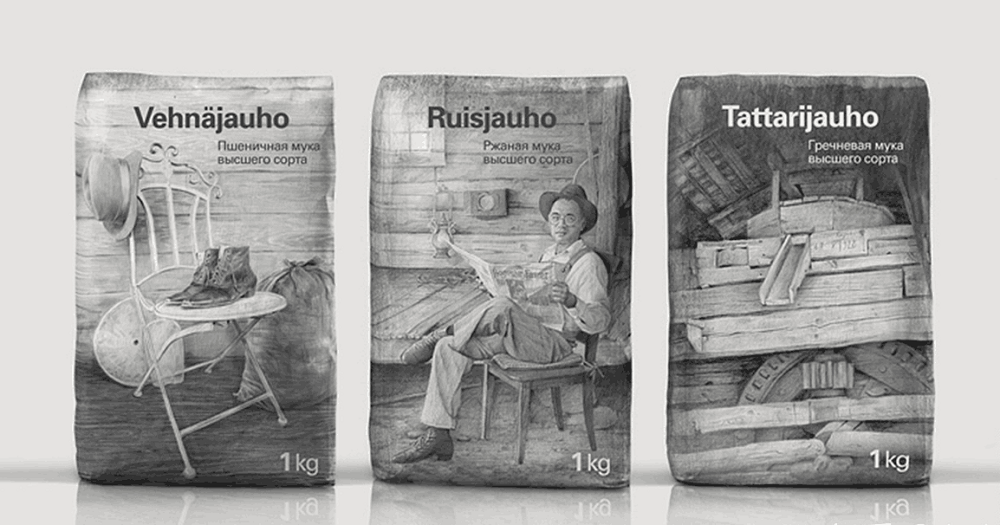
Myllyn Paras Flour is a flour brand from Russia that has been on the market for 90 years since its birth in 1928 with excellent quality. In recent years, its parent company has invited the Russian design team DepotWPF to redesign the packaging of its series of products to cope with the increasingly fierce market competition. Based on the brand’s long history and consumer perception, Depotwpf draws the story of its brand from its small workshop with pencil drawings, focusing on the core selling points of its mailing history tradition, and the overall thick sense of history and unique pencil illustrations have obvious visual differentiation from similar competitors in the market, laying a good foundation for product sales and market occupation.
Top 8 – Illustration structure unique chocolate chip cookie food packaging design
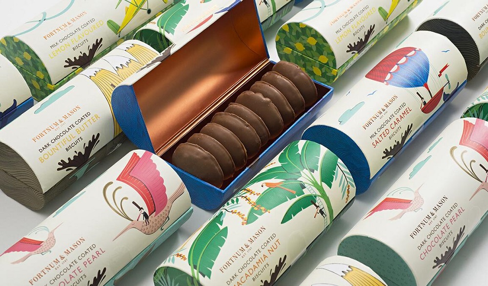
Fortnum & Mason is a well-known British food brand founded in 1707, which has been around for three hundred years with its positioning of “good for the happy self”, and their latest chocolate chip cookie packaging design was made by London-based design agency Togetherdesign. Fortnum & Mason chocolate chip cookie products are sourced from high-quality production regions around the world, and the target group is young consumers who are more concerned about quality of life. After research and analysis, Togetherdesign design agency focused on the packaging design creativity of “traveling with deliciousness”, respectively integrating hot air balloons, birds, airplanes, rainforests, oceans and other patterns into the illustration graphics of the main body of the packaging, and at the same time combined with the external shape of the product to design a more unique and interesting product packaging, which is not only conducive to the display of products in the mid-end sale, but also convenient for consumers to open edible products, and similar products in the market have obvious visual differentiation.
Top 7 – Creative honey food and beverage packaging design for joyful fashion
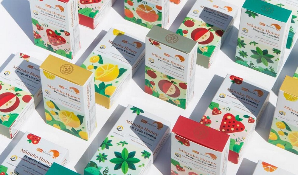
Kevin Lam is an Australian designer whose masterpiece is Kiwi Manuka Honey Fruit Food Brand packaging design. Kiwi Manuka honey fruit food is mainly characterized by natural health and multi-flavor, its raw materials are mainly from New Zealand, and the product audience is mainly young and fashionable people. According to the preferences of the product audience, Kevin Lam takes fashion illustration as the overall packaging design style of the brand, and uses fruits and natural scenery as the main visual graphics of the packaging to highlight the brand’s natural health characteristics.
Top 6 – Sharapova’s fashion creative candy food packaging design
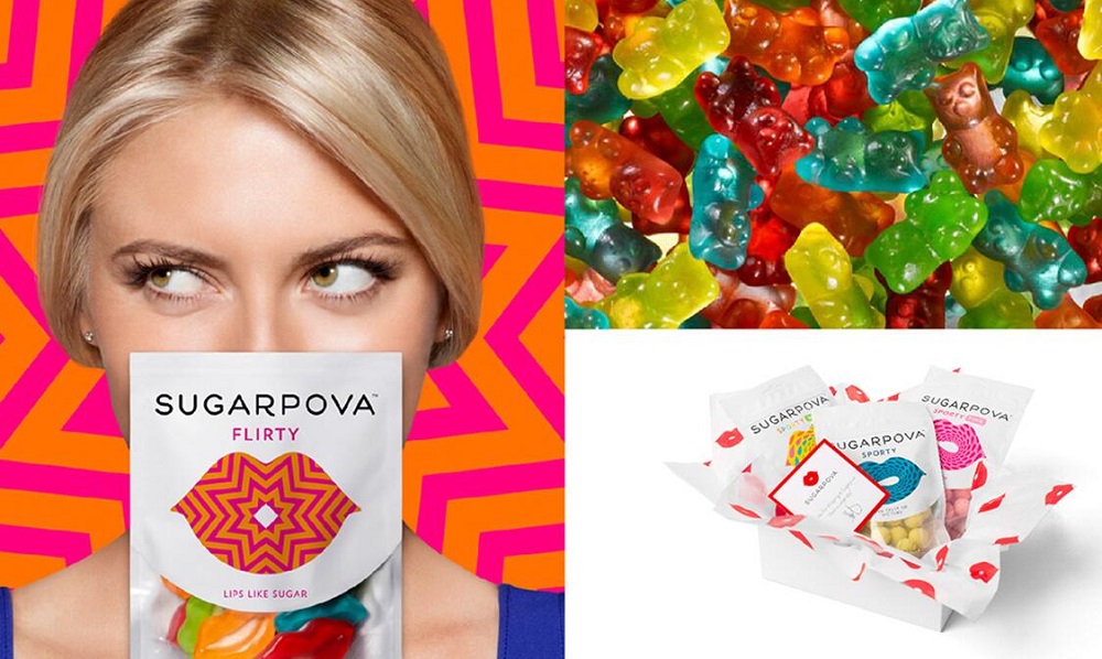
Laurensheldon is a designer from the United States, and his masterpiece is the packaging design of sugarpova, a candy and snack brand founded by the well-known tennis player Sharapova. In the sugarpova packaging design project, Laurensheldon created the brand logo, and made full use of the logo as a super visual symbol of brand packaging, integrating fashionable graphics and colors into the brand logo shape, and matching the transparent skylight part of the candy outer packaging (displaying the actual product product) to form a unified and rich packaging visual system. Under the premise of saving packaging design input costs, it is not only conducive to the presentation of product series, but also lays a good foundation for brand communication and product sales.
Top 5 – Cute and playful snack food packaging design
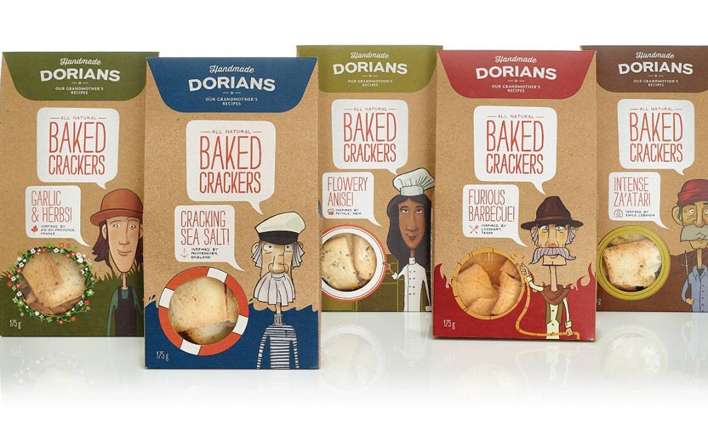
DORIANS products started from the snacks made by the founder’s grandmother. Its raw materials and flavorings come from all over the world. The core selling points are tradition, health and high quality. The audience is mainly young people. So Thesmallmonsters team created illustration characters as the visual identification symbols of product packaging, and these illustration characters include: sailors, chefs, farmers, cowboys, etc. Although the images of these illustration characters are different, the unified visual style is perfect. It interprets the core origin concept of the product. At the same time, the traditional and simple kraft paper is chosen as the packaging material, which perfectly interprets the core concept of the DORIANS brand.
Top 4 – Interactive and humorous creative candy snack food packaging design
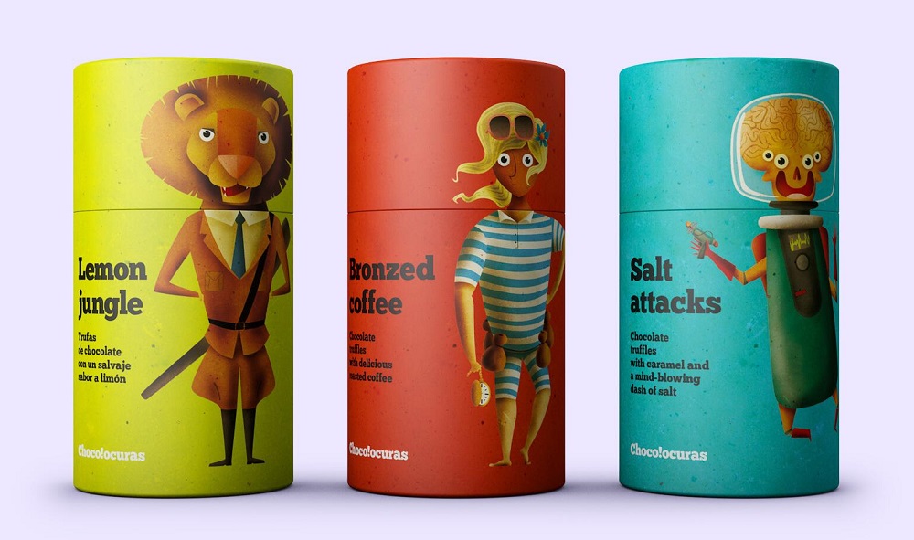
With the upgrading of global consumption and the popularization of Internet thinking, interactive packaging design that can give full play to the advertising communication function of product packaging has also emerged, among which the packaging design of Cchocolocuras candy dessert is a typical representative. Chocolocuras is a confectionery and pastry brand from Europe, where joy and humor are the core value concept of its products, the brand’s product packaging design was done by the Spanish design team Supperstudio. The Supperstudio design team took the cylindrical shape of the outer packaging as the creative starting point, integrating the images of thieves and policemen, lions and hunters, housewives and pets into the same packaging. When the package is opened, the two images swap bodies and heads, reflecting their humorous brand appeal. The unique design presentation and similar product packaging have obvious visual differences, laying a good foundation for brand communication and product sales.
Top 3 – Fun creative snack snack nut food packaging design
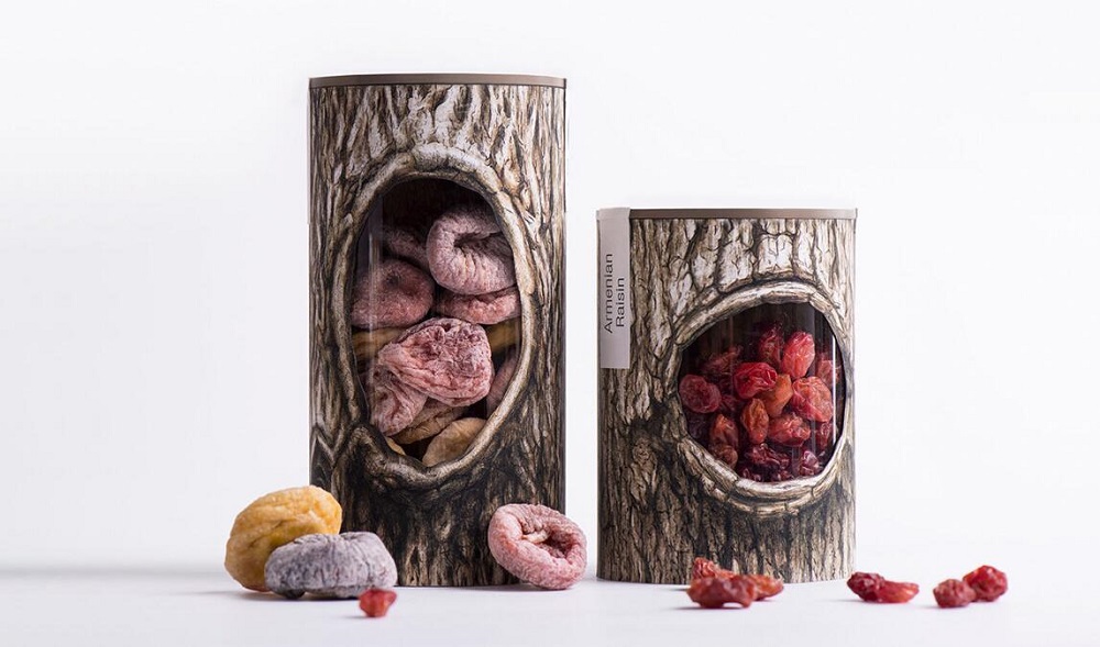
Pchak snack nut packaging was made by the Armenian backbone branding design team. Compared to similar products, Pchak’s nut products are all from natural origins, and “pure nature” is the core selling point of its products. The backbonebranding design team broke the traditional packaging design techniques, took “Squirrel House” as the core concept starting point of this design, combined the image of the tree hole drawn by hyper-realistic technique with the packaging can, and hollowed out the tree hole part, through which the actual product can be directly seen. “Tree hole, nut” is also a perfect metaphor for the existence of nut-loving small animals squirrels, unique creativity and perfect design execution make the product have obvious visual differentiation compared with similar competitors, and the packaging won the Pentawards 2017 Gold Award, known as the Oscar of packaging design.
Top 2 – Super Visual IP Creative Tea Beverage Packaging Design
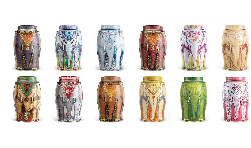
Williamson Tea is a centuries-old black tea brand from the UK, and the packaging design of the tea is made by the well-known British design team Springetts. Williamson Tea’s long history dates back to the Victorian era, and after more than two hundred years of development, its tea production area covers almost all the world’s high-quality tea producing regions, while its overall visual system symbol retains the elephant image of the brand’s inception. The Springetts design team also retains the brand’s super visual symbol in the Williamson Tea new product packaging design, and at the same time, with a three-dimensional seamless splicing design method, the elephant image is perfectly integrated into the packaging design of the tea can, so that the Williamson Tea packaging design not only perfectly continues its visual identity symbol, but also has obvious visual differentiation and visual identity in the packaging design with similar competitors in the market.
Top 1 – Deformable creative food green packaging design
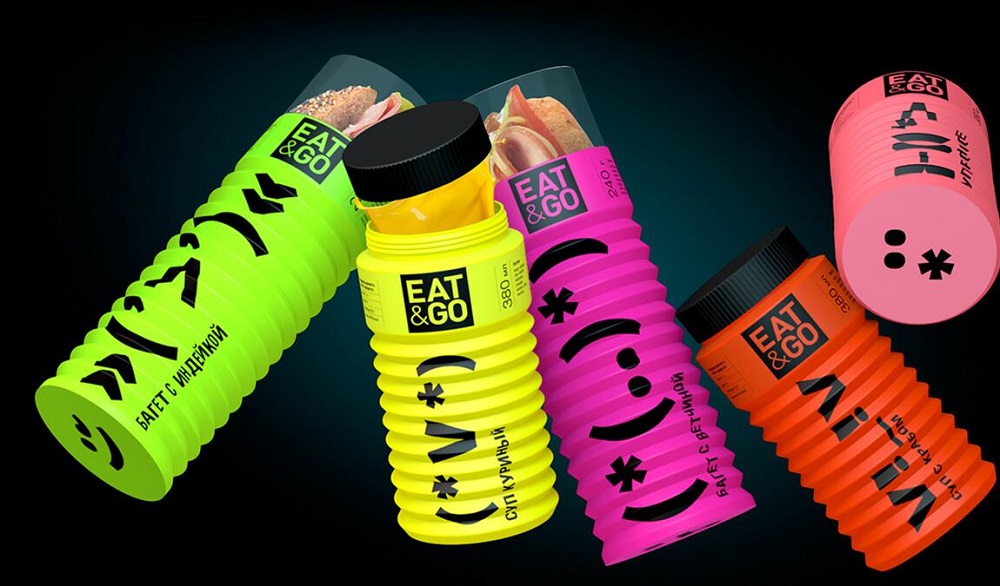
Eat&Go is a concept food and beverage brand aimed at the younger population, and the packaging design of the brand is done by Russian designer Diana Gibadulina. The outer shape of the packaging design adopts bellows that is easy to fold and deform, which can meet the needs of different food sizes and volumes, and can be used as a water cup for secondary use. In terms of visual presentation, Diana Gibadulina uses online social emojis that young people prefer, and the emoji will change with the length of the bottle, which is a fun and interactive product experience that shortens the distance between the product and the consumer. The unique bottle shape coupled with social graphic symbols makes this product visually different from competitors.

Top 10 Creative Cosmetic Packaging Design Ideas & illustrations 2023 | Luxury-Paper-Box.Com
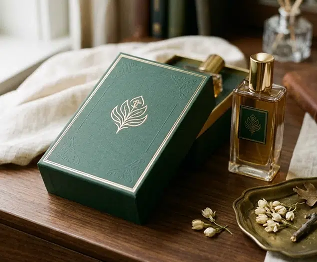
How the Right Perfume Packaging Sells the Scent
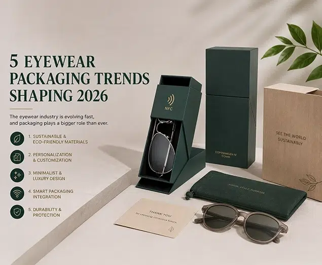
5 Eyewear Packaging Trends Shaping 2026