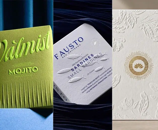


Top 10 Creative Wine Packaging Designs (Label & Bottles) 2023 | Best Wine Packaging Ideas
The variety of wines not only enriches our lives but also soaks our bodies and minds. While we are moisturized, we are also greatly satisfied in terms of visual senses, and all kinds of personalized packaging are endless, marking their own unique charm and exuding a charming wine aroma, which people can enjoy.
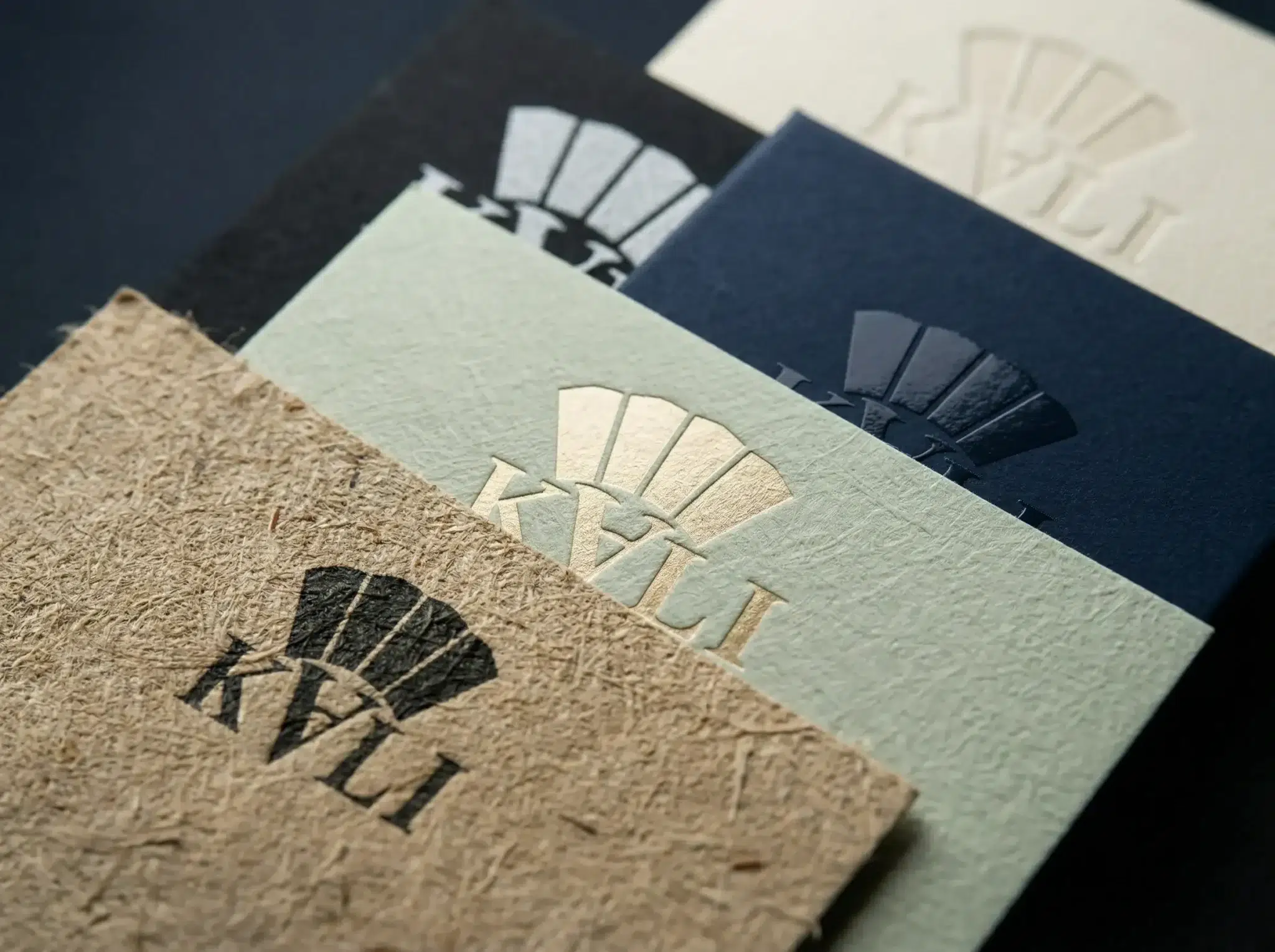
The packaging of various types of wine can be displayed on the packaging screen according to different categories, and the combination of some special processes and materials can be displayed. It can also be designed according to the meaning and value given by the company to this wine so that the picture mainly reflects its culture and highlights its connotation.
We all know that red wine packaging boxes can improve customers’ desire to buy and purchase decisions. However, the label on the packaging box or red wine bottle is also an important element that customers pay attention to when purchasing red wine. Therefore, we should also focus on it when designing and customizing packaging labels.
Top 10 Best Wine Packaging Lable & Bottle Design Ideas
Below we share the 10 most creative wine packaging designs. When designing wine labels, we can draw inspiration from the following creative designs.
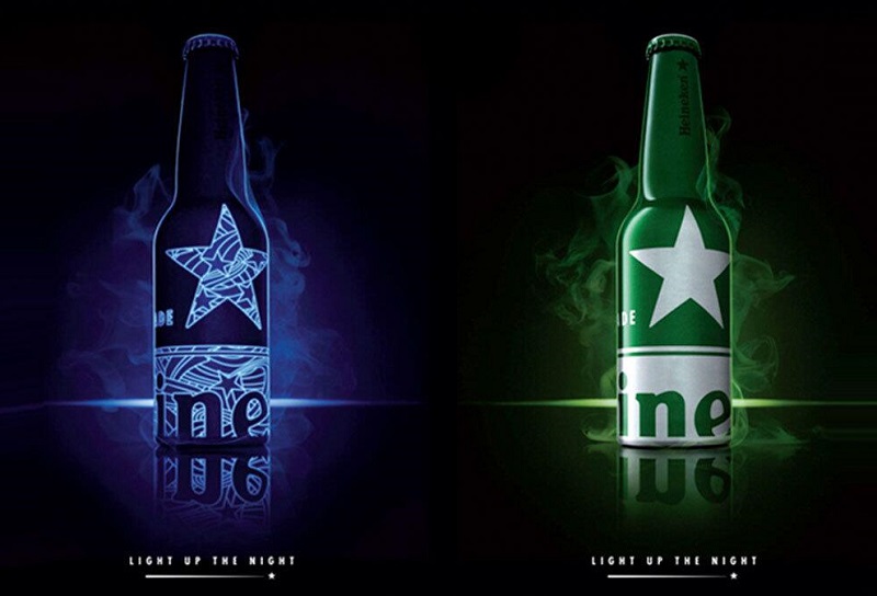
10 – Heineken
Heineken’s limited edition aluminum packaging design was created by Dutch design team dbod. The beer packaging design fully incorporates Heineken’s super visual design symbol, the star, and uses glow-in-the-dark ink technology to print this super visual symbol. It has a unique visual appeal and memorability.
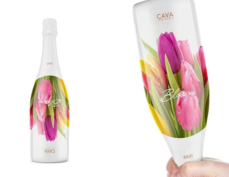
9 – Solera Beverage
Solera Beverage Group is one of the largest beverage groups in Northern Europe, specializing in the import, marketing, sale and distribution of wine, spirits, beer and other alcoholic and non-alcoholic beverages. A number of years ago Solera Beverage Group approached the Norwegian packlab design team to design the packaging for one of its Cava sparkling wines. packlab’s clever and sophisticated approach was to start with the characteristic floral scent of the sparkling wine itself, and to think of why not make the bottle a bouquet of flowers. It is a bouquet of flowers, a bottle of wine, and a flower that connects the whole concept.
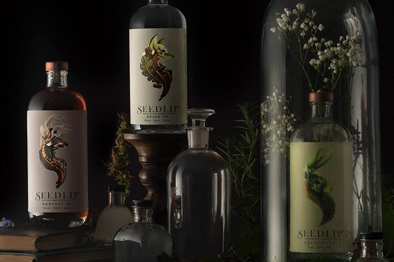
8 – Seedlip
Seedlip is a sugary non-alcoholic botanical drink brand from the UK and the number one brand in this category in the UK. their packaging design was made by the famous British design team Pearlfisher. Seedlip products are made from natural ingredients such as: orange peel, individually distilled bark, grasses, spices, etc. The core concept of the brand is. “The Art of Nature”. Therefore, Pearlfisher takes the initial letter “S” of the brand name as the creative starting point, and integrates the raw materials of the product into the letter graphic, forming the unique animals of the British countryside: red fox and hare, highlighting the core concept of the brand and at the same time having obvious differentiation from similar products. This creative design approach is similar to the domestic Nongfu Mountain Spring student water packaging design.
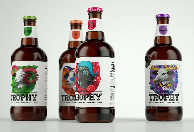
7 – Trophy
Pavla Chuykina is an Australian designer and illustrator, and one of her masterpieces is the Trophy concept fruit-flavored beer packaging. The history of the beer is closely related to the hunting culture and its main audience is relatively young, so Pavla Chuykina used pencil-drawn animal illustrations as the main graphics to reflect the hunting culture and incorporated fruits to represent the beer’s flavor formula. The overall packaging design has a unique visual aesthetic and is visually distinctive compared to similar products.
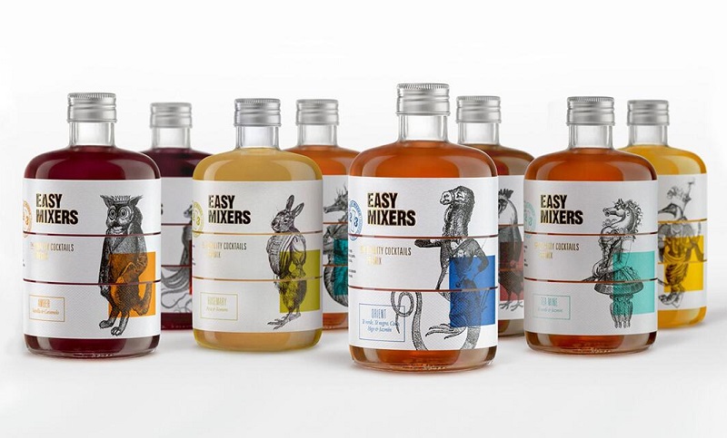
6 – Easy-Mixers
TSMGO is a famous design team from Spain, and one of its masterpieces is Easy-Mixers, whose bottle label design is based on the 2/3 rule of cocktails (two non-alcoholic and one alcoholic), dividing the bottle label into three separate parts and drawing the image of relay, which originated in the 1920s. The bottle label is divided into three separate parts and incorporates the 1920’s game of relay drawing (where the participants draw a part of the bottle without interfering with each other to create a unique picture) into the bottle label design, and each part of the bottle label presents a different illustration graphic, which in turn creates a unique illustration.
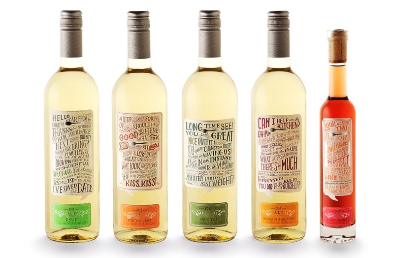
5 – Small Talk Vineyards
This Small Talk Vineyards wine label is very creative and allows customers to start a conversation from the wine label. It is no exaggeration to say that these wine bottles are slowly being opened. Most of what is printed on them are simple questions and answers, such as: How is the weather? What good book have you read recently? It’s not just the text itself that is innovative and cool, the design itself is amazing, with the phrases that the labels focus on all printed in different sizes, very carnivalesque.
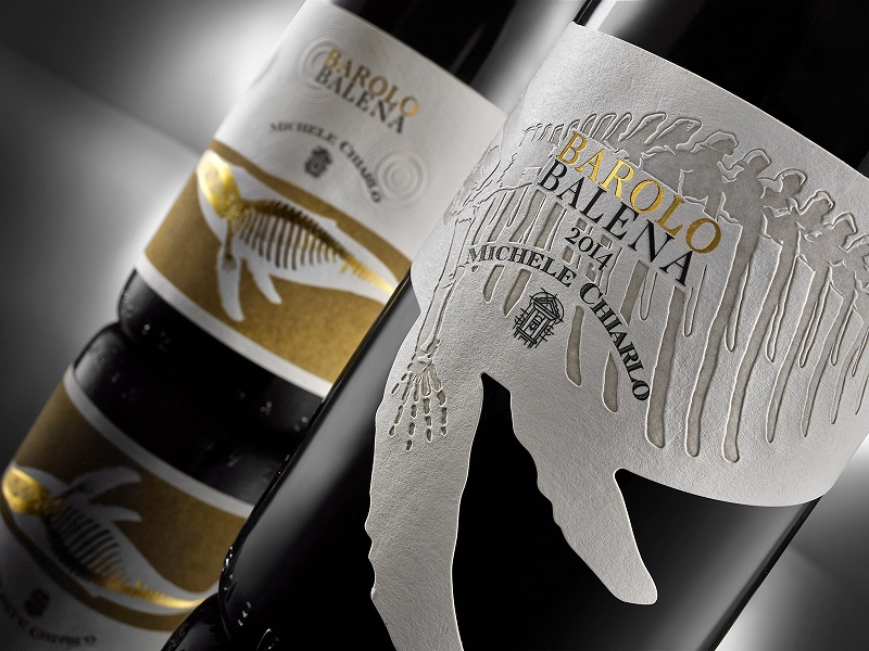
4 – Barolo Balena
This Barolo Balena label, designed by Michele Chiarlo, resembles a whale in shape and has a great deal of detail on the label. The whale skeleton is embossed, which greatly enhances the visual effect of the wine label as well as the tactile effect. the logo is printed by foil stamping process, which can play a role in highlighting the design theme in the label.
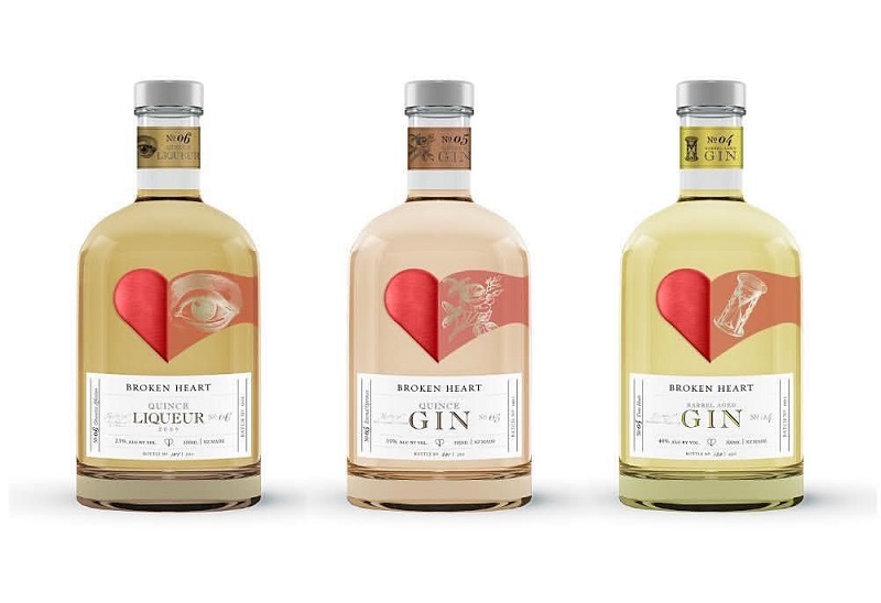
3 – Broken Heart Gin
Broken Heart Spirits’ heart-shaped label adds a lot of creativity to the packaging. The heart-shaped image also conveys the fact that gin is good for the heart. Taking advantage of the spirits’ transparency, the heart-shaped image is split in two at the front and back of the bottle, visually appearing as if one half of the heart is slowly coming together with the other half.
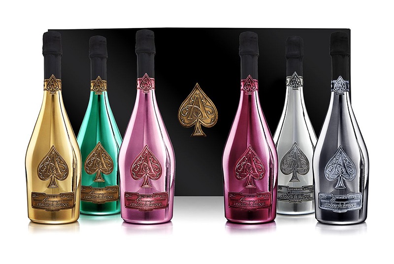
2 – Armand de Brignac
This is probably the most expensive wine in these cases. We can see it in the bottle of the wine and in the logo. The metal label of the wine can give the impression of being expensive and high status. Both the bottle and the metal label reveal the high end without fail.
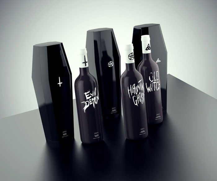
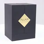
1 – Possession
Also red wine packaging, this unique design, creative red wine box really makes people shine, breaking the usual impression of red wine to people, no longer sweet, mellow feeling, replaced by a dark, fearful feeling, but it is this darkness filled with the difference, so that people will have a desire to get the emotion, more willing to choose to buy this wine.

Top 10 Creative Cosmetic Packaging Design Ideas & illustrations 2023 | Luxury-Paper-Box.Com
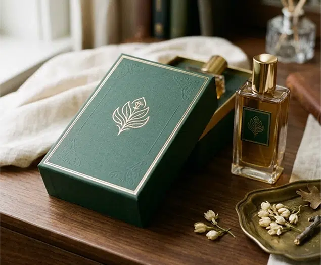
How the Right Perfume Packaging Sells the Scent
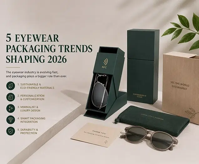
5 Eyewear Packaging Trends Shaping 2026