

Top 10 Most Creative Chocolate Packaging Designs (Box & Illustration) 2024
The chocolate industry is known for its rich traditional heritage, yet modern consumers are often seeking a blend of both classic tastes and innovative experiences. The packaging of chocolate plays a crucial role in capturing the attention of these consumers, especially on crowded store shelves. The top 10 chocolate packaging designs of 2024 demonstrate a fusion of creativity, cultural storytelling, and modern design trends that not only represent the essence of the brands but also resonate with the evolving preferences of the target audience. These designs have successfully utilized illustration and packaging as an extension of their brand stories, creating a memorable and engaging experience for chocolate enthusiasts.
Top 10 Creative Chocolate Packaging Box & Illustration Design Ideas 2024
In our conventional impression, most chocolate packaging designs would adopt real chocolate photos as packaging patterns. But this is just a traditional packaging design approach. If you want your chocolate delicacy to stand out on the crowded shelves as a globalized food, you need to adopt more innovative design techniques for packaging design.
Now some creative chocolate packaging designs, through diversified and stylish colors of illustrations plus flat graphic processing techniques, create a big difference from common chocolate packaging, which not only establishes visual differentiation in packaging design but also firmly grasps the aesthetic preferences of young consumers. Here we share ten very design-oriented chocolate packaging designs with great creativity.
Top 10 – Sabadi Chocolate
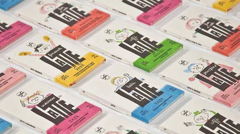
The milk chocolate series of Italian chocolate brand Sabadi was designed by the Happycentro design team. To be closer to the mass consumer group and the mass market pricing, the design team started with interactivity and fun to design the family members for Sabadi packaging: grandma, mom, daughter, grandpa, dad, and son, to establish the association between products and wide audiences. The illustrations adopt a light and free crayon sketch drawing style, depicting a family in a happy, easy, and leisurely state with a certain storyline and topic. Integrating the different flavors of the product into the light and natural color illustrations of the characters, this storytelling narrative design targeting chocolate fast-moving consumer goods forms both overall and independent product packaging design systems, most importantly, laying the foundation for brand communication and product sales.
Top 9 – Baianí Chocolate
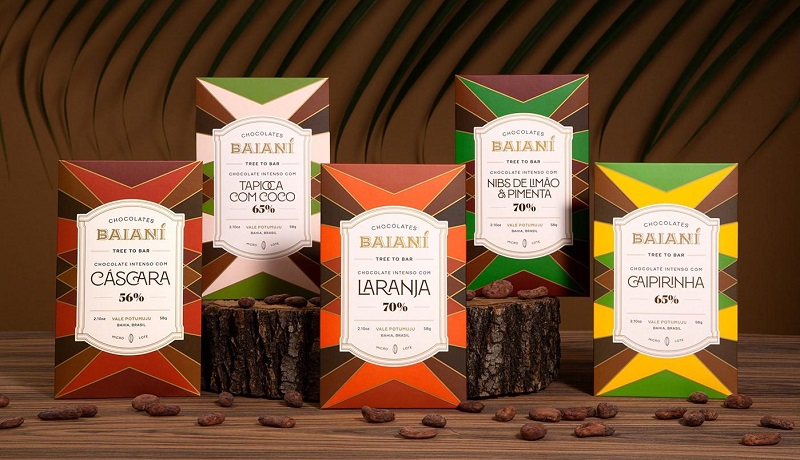
Baianí is a chocolate brand from Bahia, Brazil. From planting, harvesting, and processing to finally becoming delicious chocolate, the brand is responsible for the entire production line. This chocolate has great market potential and is also beloved by customers. Baiani’s founders Tuta and Juliana Aquino have their cocoa farm in a special place called Vale Potumuju in Bahia state. They ensure personal participation in every step of chocolate production and provide the best quality. Since some new flavors were added, different packaging features were given according to different flavors when doing chocolate packaging design. Unequal strips of graphics and text, a complete and clear information introduction, including chocolate type, variety, roasting process, cocoa bean source, and proportions all need to be reflected on the packaging. All visual output elements are a combination of attractive graphics and meticulously designed information hierarchy. This chocolate packaging design avoids homogenization with the packaging of other market products, has its own brand features, and the packaging is easy to browse and looks as delicious as chocolate.
Top 8 – MAROU Chocolate
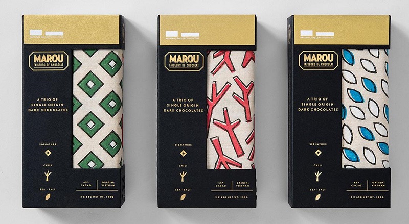
The MAROU chocolate food packaging design was done by the Vietnamese design team rice-creative. The chocolate is produced by the National Art Museum of Singapore, which houses the most and most comprehensive collection of modern artworks from Southeast Asia. Therefore, rice-creative focuses the package design graphics on the unique structures of the art museum buildings, selecting handcrafted and historically strong grass paper as the carrier to present. And the unique handcrafted lithography embodied the packaging patterns perfectly reflects the concept of limited handmade products.
Top 7 – Nibbo Chocolate
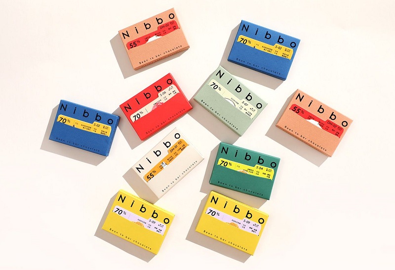
Nibbo’s fine chocolate has very distinctive and striking flavors, it is like a “flavor museum” containing many experiences that surprise the taste buds. Taking “flavor museum” as design inspiration, the flavor card of each chocolate is designed in the style of museum collection labels, in addition to clear flavor guidance on the card, there is also an exclusive serial number from Nibbo, and the outer packaging box structure of chocolate is designed in the style of a mini file box, allowing chocolate lovers to collect various good flavors in Nibbo’s “flavor museum”. The outer box structure of chocolate adopts the form of a file box, each file box has a label card dedicated to this piece of chocolate, the card follows the basic grid system regulations. When you open this MINI file box, there is a sentence inside “you deserve better chocolate”, when you open the whole box, the illustration of FROM BEAN TO BAR CHOCOLATE lets you quickly understand how a fine chocolate is made. At the same time, there are two details worthy of attention on the packaging: the first detail is that the slot of the chocolate front is a smiling arc, and the second detail is that the back of each variety chocolate box has a small illustration related to cocoa beans, with a little humor. Because Nibbo hopes to bring happiness.
Top 6 – Danaus Chocolate
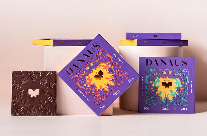
The premium bean-to-bar chocolate company Danaus, based in Lima, Peru, uses the Danaus butterfly (more commonly known as the monarch) as the inspirational symbol at the heart of its visual identity and packaging design – representing the kind of positive transformation it aims to inspire in customers. The layered packaging depicts the butterfly’s lifecycle from caterpillar to chrysalis to airborne form, while the varying thickness of the logo mimics the delicate wings and varied thickness of the Danaus butterfly itself; further tying the brand story together, the dimensions of the chocolate bars measure precisely 10cm to match the monarch’s average wingspan, bringing consistency between the product, packaging and Danaus’ namesake symbol into one holistic visual narrative focused on the transformative journey of this iconic insect.
Top 5 – Le Chocolat des Français Chocolate
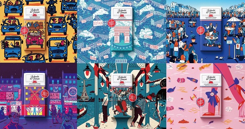
Le Chocolat des Français is an art-inspired chocolate that was born with art. Its three founders were classmates at an art school, and decided to create a chocolate brand together because of their common love for chocolate after graduation. In order to pave new roads in this “traditional” industry, and at the same time continue to give play to their artistic backgrounds, they chose to work hard on packaging. Artists use scene-oriented illustrations for packaging, drawing inspiration from life but exceeding life in artistic expression, with high aesthetics that make people unwilling to open it.
Top 4 – Candela Chocolate
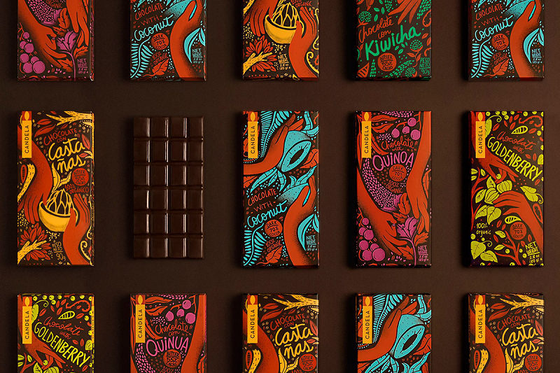
Candela is a chocolate food brand from Peru. The latest product packaging design was completed by the infinito team. Candela’s chocolate products feature natural quality ingredients and traditional handcrafted production as their greatest features. The brand hopes that the infinito team can create a new packaging design that meets the needs of the current mainstream target groups and highlights the unique personality and category differentiation of its chocolate products. After research and analysis, the infinito team positioned the new product packaging style in the popular illustration style trend. The illustrations are composed of natural raw materials of the product. A “hand” pattern representing the concept of handcrafted production is also incorporated to perfectly present the advantages of the product with highly contrasting colors.
Top 3 – Cadbury Chocolate
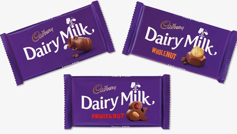
Pearlfisher design team is from the UK. It currently has branches in London, New York and Copenhagen. Awards include: New York Advertising Award Gold Lion, Cannes Lions Gold Award, Pentawards Gold and Silver Awards, etc. Brands served include: Help Remedies pharmaceutical, Cadbury, etc. Cadbury is one of Pearlfisher’s long-term customers. The packaging design of Cadbury’s nut chocolate was created by them. The chocolate nuts packaged selected Cadbury’s standard color – purple as the main color, with 3D stereoscopic nuts and creative chocolate shapes combined to form the main visual symbol of the packaging design. And the different shapes of chocolate also represent the different flavors of the product, with vivid graphic style and unique creativity, making the packaging design have very strong visual identity.
Top 2 – MARANA Chocolate
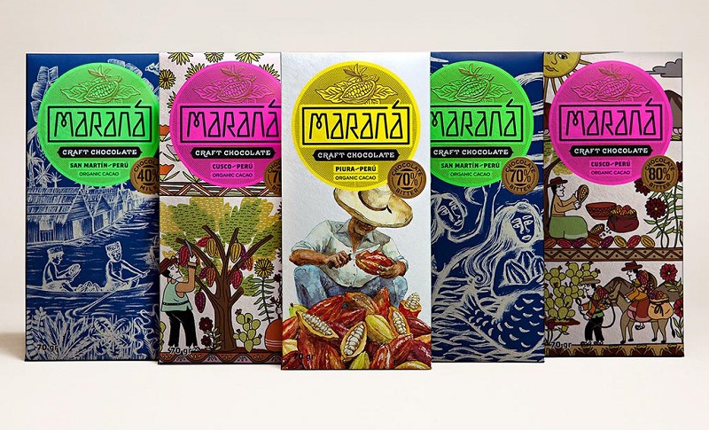
The MARANA chocolate food packaging was designed by the Peruvian design team icono. The product is produced in Peru mainly based on traditional handcrafted production. Therefore, icono uses the planting, harvesting and grinding process of the product as the visual graphics. It is manifested in the form of illustrations with obvious handmade traces to perfectly reflect the core selling point of the product. It has obvious visual differentiation compared to similar products and lays a good foundation for product sales and brand communication.
Top 1 – XONOCHOCO Chocolate
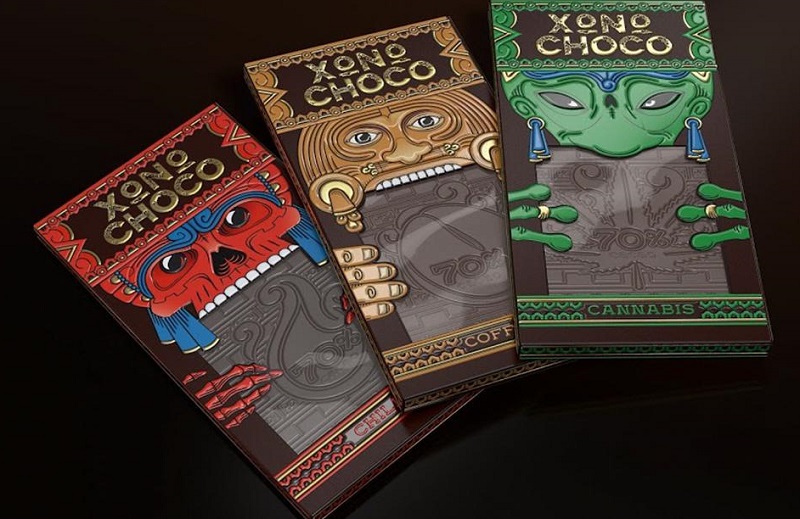
XONOCHOCO is a conceptual chocolate food brand designed by the Russian brandbrothers design team. The main raw material of the chocolate comes from the Aztec region and is mainly targeted at young consumers. Based on the quirkiness of young people and combining the legend of aliens in the Aztec region, brandbrothers designs the visual symbol of the packaging with illustrations of alien shapes, and perfectly combines this visual symbol with the product. It forms the overall visual image of the packaging and has obvious visual differentiation compared to similar competitors. It perfectly conveys the core competitive advantage of the product.
Every brand hopes that products can attract more customers during the sales process. For chocolate, in addition to the original fame of the brand, one of the best ways for your product to stand out is through innovative and creative packaging design. The above designs all achieve differentiation through imagination graphics, storytelling, cultural connections and modern aesthetics. Creative packaging is a powerful way to attract attention and maximize sales potential for chocolate brands.

Top 10 Creative Cosmetic Packaging Design Ideas & illustrations 2023 | Luxury-Paper-Box.Com
How the Right Perfume Packaging Sells the Scent
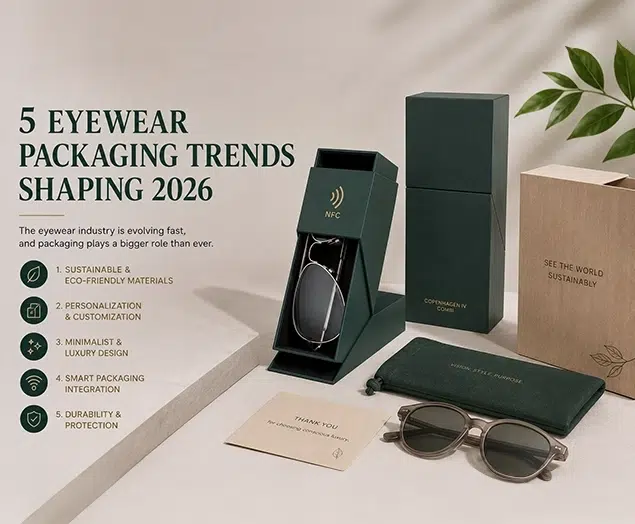
5 Eyewear Packaging Trends Shaping 2026