

Top 5 Tips On Create Your Packaging Box Design On Illustrator To Avoid Mistakes
In our previous article, we talked about how to use Adobe Illustrator to design die-cut packaging boxes, it is actually not difficult! But there are some mistakes that almost everyone who uses Illustrator for the first time will make, so how to solve these problems? Read the following tips carefully.
- Never Edit the Die Path
Any alteration of the layout could be fatal: it represents the cut and fold shape of the box; any variation to its lines could cause malfunctions or errors to the entire packaging structure. To avoid accidentally modifying the die-cut path I suggest you open the file with Illustrator and immediately lock the layer in which it is located. Then you just need to create a new layer intended for graphics.
- Consider The Abundance of Printing
Each path is made up of lines of different colors according to their function. We cannot always count on a precise assembly of our packaging to the millimeter, but we can strategically compensate for even a minimal margin of error by extending our graphics beyond the cutting lines up to those of abundance! If during the die-cutting process a millesimal misalignment of the print sheet occurs, the graphic abundance will serve to prevent the appearance of unsightly white threads along the edges of the box.
How To Make Solid Bottom That Perfectly Follows The Outline of Packaging Abundance?
- Open the path in Illustrator and before locking the layer select one of the green lines of abundance. All the other green segments will be automatically selected using the “Select> Similar> Trace color” Copy the selected lines (ctrl / cmd + C) within the new layer created for the graphics, in the same position (shift + ctrl / cmd + V), and merge them (ctrl / cmd + J). Lock the die path layer, select the newly created shape and fill it with the desired background color.
- Create the outline of the abundance in the graphics layer as specified in the previous point. Lock the path layer, move it above the graphics layer, create a single rectangle or many geometric shapes that cover the entire die, without following its shape, setting the fill color you want for each one. After creating the various shapes, use the outline of abundance as a clipping mask for these elements: in this way, your graphics will perfectly follow the outline of the die-cut path.
- Do not Insert Text and Pictures Too Close To The Lines
Enter all the most important information and images, which must be visible and legible, at least 3/5 mm away (or even more, depending on the size of the package) from the die-cutting and folding lines, so that is accidentally cut or do not end up on the folds of the box during assembly.
- Use Images and Effects In High Definition
If you want to insert images or raster effects within your graphics, it is very important that both are high definition (300 DPI / PPI). As for the images, just check the resolution using the “Links” panel which can be activated from the “Window” menu. In this way, you will be able to view all the information relating to the various elements entered within the worksheet, including the resolution.
For printing, it is recommended to use images with at least 250 DPI.
The resolution of any raster effects used can instead be set via the Effect menu> Document raster effects settings> High resolution (300 PPI).
- Make Layout Before Inserting Images and Text
Very often, during the two-dimensional graphic design of the custom packaging box, a fundamental factor is not taken into consideration: the three-dimensionality of the box.
During the assembly of the packaging the various faces, which in the die-cut layout are arranged on a single plane, will be suitably folded to form the box. Precisely for this reason, before inserting the various graphic elements within the layout, you must have in mind the final arrangement of the various parts of the box in order not to risk finding yourself with texts and images in a position other than the desired one or, even worse, in reverse. Each type of box chosen corresponds to different positioning of the graphic elements.
How To Layout Your Packaging Design?
The simplest and most direct thing is to print the die-cut pattern of your box on a sheet, with any graphic references on the various faces, cut it out and fold it to get an idea of its final composition.
This way you will know exactly how to orient the various elements without risking that texts, images, and logos are printed upside down. In our case, we chose a linear pencil box which is one of the most common packaging models. And its die-cut path looks like this:
- A1 + A2 = Main panels
- B1 + B2 = Lateral walls
- C = Glue flap
- E1 + E2 = Top and bottom
- F = Interlocking tabs
- G = Internal fins
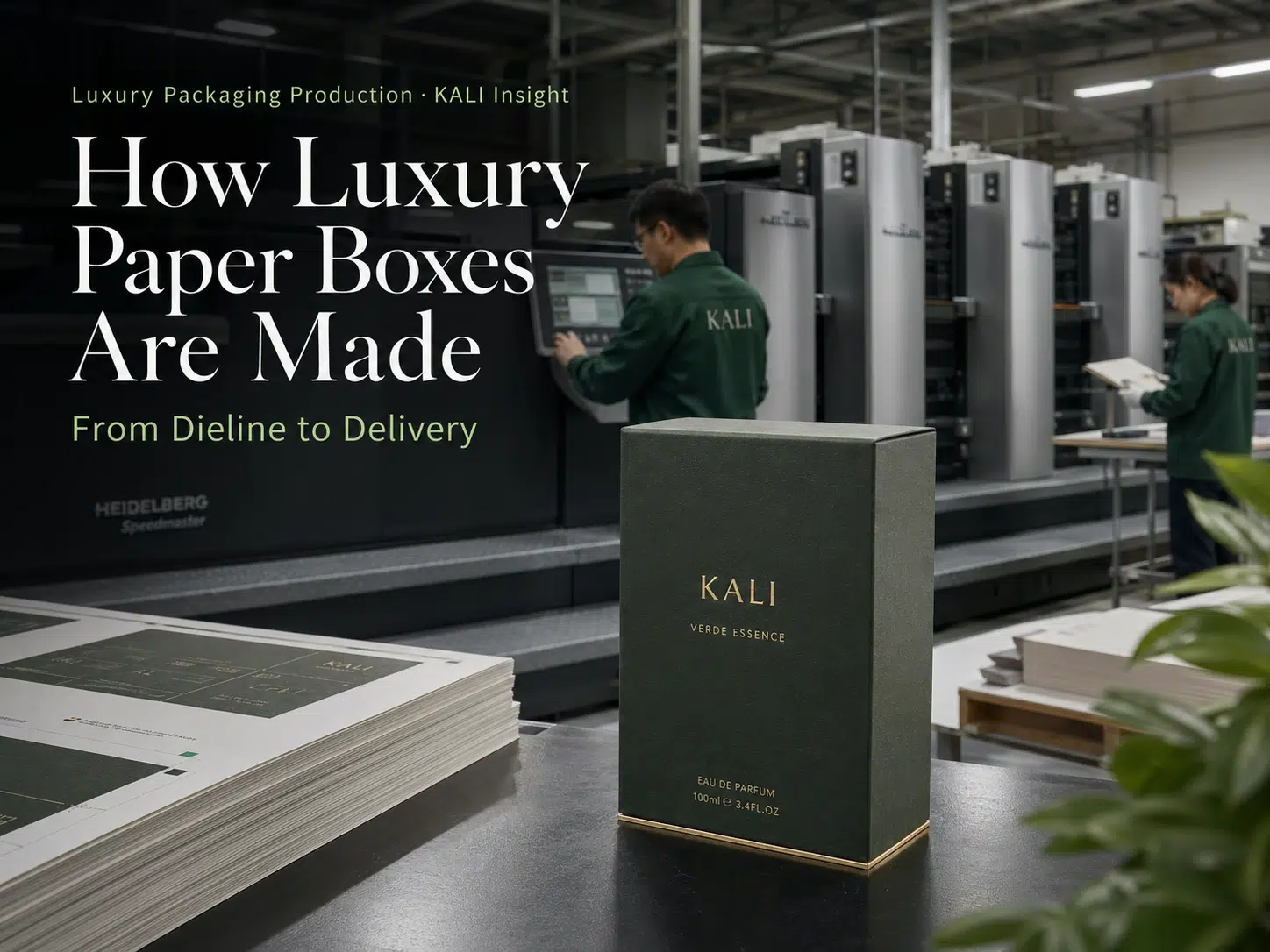
The above tips will effectively help you to solve the main mistakes you may encounter when designing packaging boxes in Adobe Illustrator. I hope it will help you. As a professional paper packaging production factory, Kali can provide you with a variety of original design concepts to help you improve brand benefits!

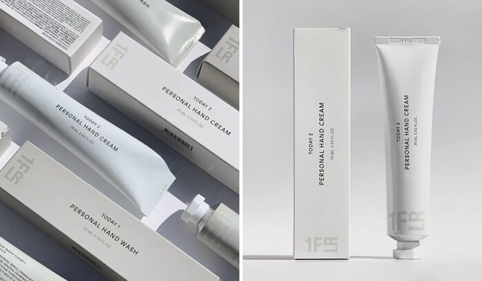
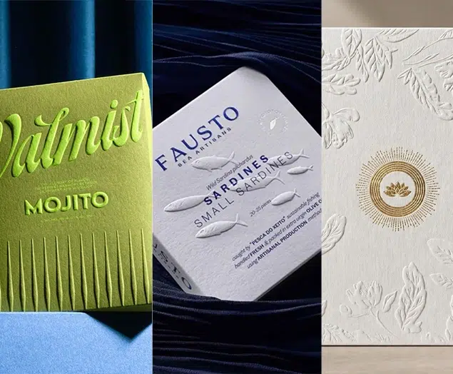
Top 10 Creative Cosmetic Packaging Design Ideas & illustrations 2023 | Luxury-Paper-Box.Com

How the Right Perfume Packaging Sells the Scent
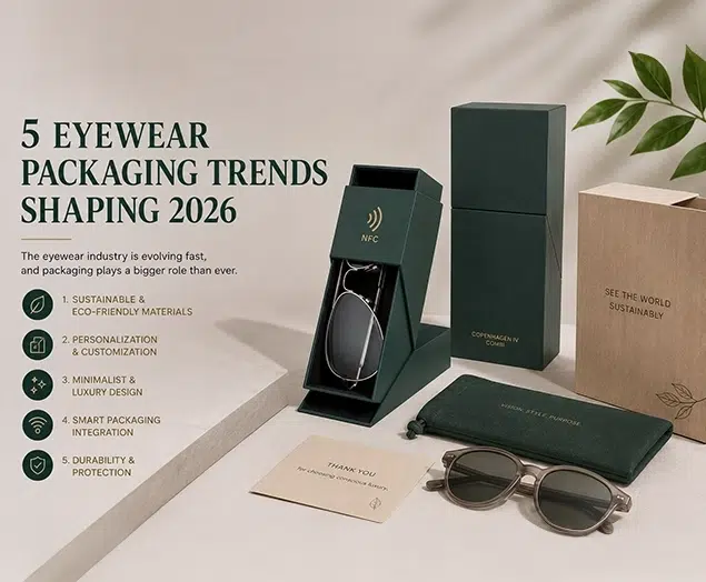
5 Eyewear Packaging Trends Shaping 2026