

Gold Box Packaging Design Guide – Best Tips To Design & Combo Gold
Brilliant gold has supreme charm. It is gorgeous, luxurious, and radiant, giving people a sense of holiness Gold should be the favorite color of all major parties because it implies dignity, auspiciousness and good luck. However, in the eyes of many paper box packaging designers, gold is a very vulgar color. Every time gold is used in the design, the picture will immediately become vulgar. However, is it true? Of course, the answer is no, because there are many excellent box packaging design cases using gold, so there is no problem with gold itself. The problem is that we do not use gold well. Next, we will show you how to use gold to design boxes. It is suggested that gold is not necessarily golden, such as gold, rose gold, champagne gold, etc.

Gold Box Packaging Design Guide – Best Tips To Design & Combo Gold
1. Try not to use gold with bright red
Since ancient times, gold and bright red are the most popular colors, so there are many items with these two main colors around us. However, in the past, designers’ aesthetic and printing techniques were relatively backward, so that most of these articles were not very beautiful. So now, when you see gold with bright red, you will feel vulgar at first. How to solve this problem? After all, many customers like this way. Here are two ways:
-Use rose, vermilion, or crimson. These colors work better with gold.
-Add additional colors. For example, add dark green, blue, or cyan, so that the picture has a contrast between cold and warm, and the visual level will be richer.
2. Gold works well with these colors
After reading many design works that use gold, we found that gold and these colors together, usually the effect is better.
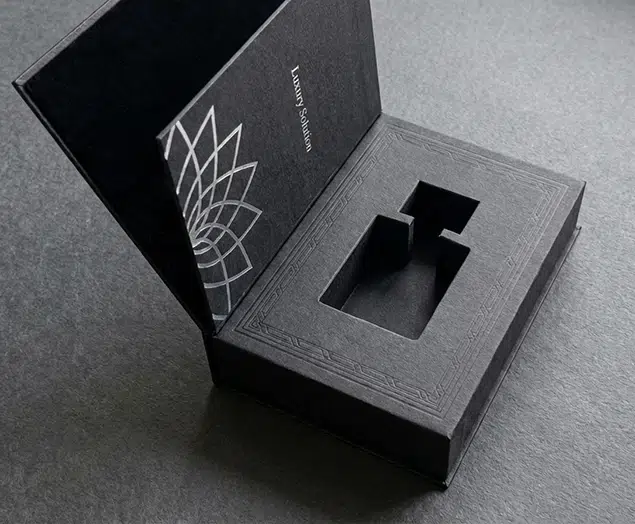
-Gold and black
-Gold and white
-Gold and cyan
-Gold and cyan
-Gold and blue
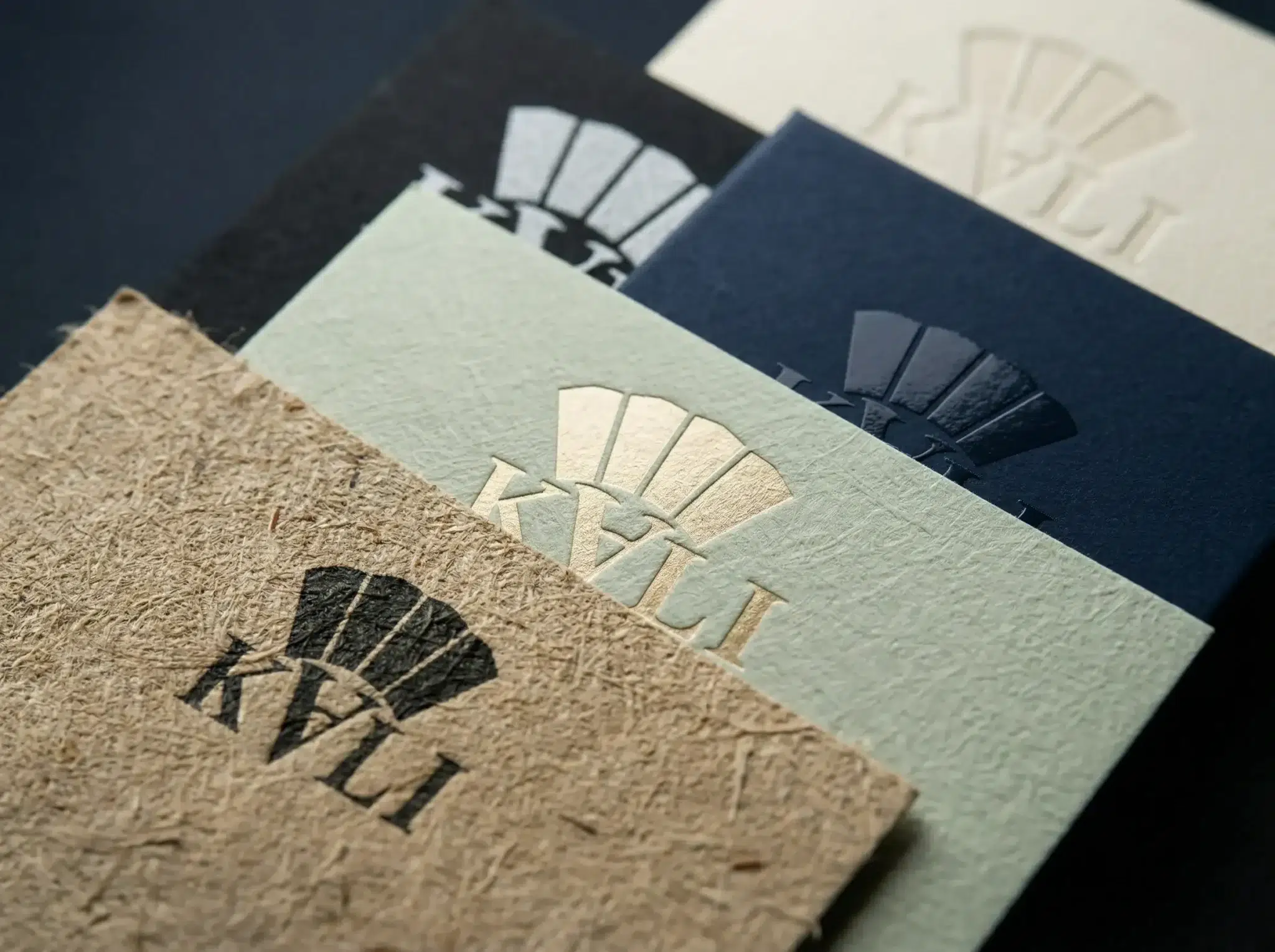
-Gold with gold, such as bright gold with frosted gold, or dark gold
3. The effect of gold is better for simple and delicate pictures
The golden metal texture is very strong. If you can depict the texture of the metal elements in the picture very carefully, then this design will really give people a sense of dignity and high-end, not vulgar.
4. Do a good job on the whole
The reason why good box packaging designs are excellent is that they are excellent as a whole, not because they are well done in a certain area. Similarly, if a work is bad, it is not just because it is not well done in a certain area. Therefore, if your work becomes tacky because of the use of gold, it is very likely that there are other aspects that are also not well done. It may be that the design form is too conventional, the typesetting has no sense of design, the picture is not beautiful, the font is not beautiful, and so on. Try to solve the problem of vulgar design from these aspects, instead of putting all the responsibilities on gold.

Top 10 Creative Cosmetic Packaging Design Ideas & illustrations 2023 | Luxury-Paper-Box.Com
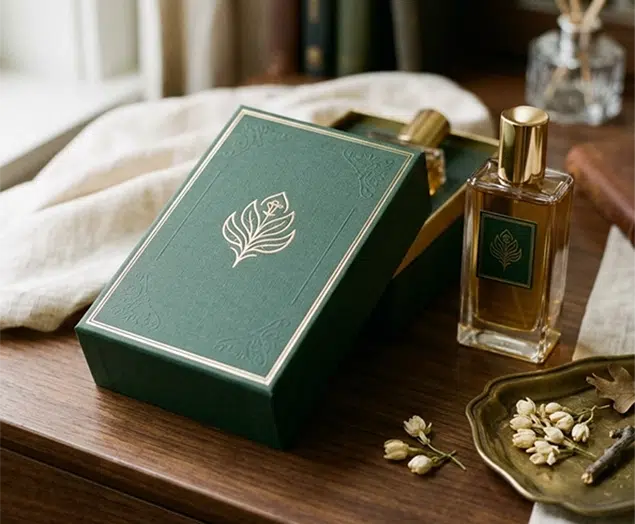
How the Right Perfume Packaging Sells the Scent
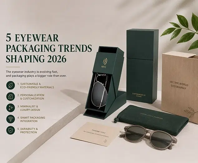
5 Eyewear Packaging Trends Shaping 2026