

How To Create Product Packaging Design – 5 Packaging Design Stages
Product packaging design how exactly is it done? From strategy to sourcing the right dieline template, there is a lot to think about, which can become confusing. That is why in this guide we are going over the complete process, so you’ll know exactly how to design packaging that stands out on those retail shelves.
How To Create Product Packaging Design – Packaging Design Stages
Stage one is where we take a deep dive into the company and figure out exactly who they are and what it’s about. Stage two is a market research and design inspiration, this is where we take time to look at competitors and source that all-important design inspiration. In stage three, we move on to sourcing a dye line template for the product. Stage four is where we use all the work in the previous stages and start designing the juicy packaging. Last but not least, stage five is showcasing the product and its packaging.
Stage 1 – Strategy
For example, the drink and business are called flow and it’s aimed at women during their menstrual cycle, it’s an energy drink filled with vitamins and minerals to help replenish the body. It also contains electrolytes for hydration and caffeine for that energy boost. So they already have a brand identity and are really clear on who they are as a business and the audience that they are targeting, but for your reference here’s some information that will really help with designing the packaging.
Target audience: around 18 to 40-year-old females.
Interests: self-care, shopping, working out, and personal development.
Busy, fast-paced environment
Design Style: energetic, vibrant, zestful, and bold
Goal: To support women with a busy lifestyle by providing them with all the nutrients that they need during their menstrual cycle, while also providing them with an uplifting boost to power them through the day.
Stage 2 – Market Research and Design Inspiration
Within this stage, we have had a look at the brand competitors’ other packaging designed to gather that inspiration, and we’ve had a look on retail shelves to see what the current market is currently doing.
Stage 3 – Sourcing A Dieline Template
Anyone that doesn’t know, a dieline serves as a package template that ensures proper layout to a printed product. It is a diagram that shows all the cut lines and folds of a package in a flattened form. In most scenarios, the client should already have a supplier that can supply you with that dieline template or if you have agreed with the client to source the supplier for them, then it is down to you to find a template. One of the most important things when it comes to packaging design is how it actually looks on the product. Is it practical? Is there enough room for important information like ingredients? It can be so difficult to tell on that flat design, which is where mock-ups come in. They are such a simple and easy way to showcase your design on the product itself. From the supplier, they should supply you with all the information about the template. So you’re not left feeling like you don’t have a clue how to use the template.
Stage 4 – Brand Identity
The first place to start is pulling in all the brand identities from your client. The next stage is to actually start designing, so prior to this, you would probably have a discussion with your client about some ideas that you have about how the packaging is actually going to look. So we know the mission of this brand is to help women during the menstrual cycle by providing them with that energy boost as well as all those vitamins and minerals too. So it is our job as the designer to basically show all this on the packaging.
Stage 5 – Design The Packaging
We’re going to start designing this label now. The first thing you need to think about is exactly where the logo is going to be. Is it going to be seen, we don’t want anything going over it, and we want to make sure that it is readable and is big enough? Once you have done exactly what you set out to do, have put the logo in place, you have designed the assets around this. The next stage that we’re going to move on to is putting in some text. So we need to obviously explain exactly what this drink is. The colors represent that well as well, and then we want to get some sort of text on there that shows what’s inside. So we need to explain that is filled with vitamins and caffeine or minerals.
The main thing that this product is trying to sell, how different this is from any other energy drink that we have seen. Because normally it is a bit more masculine, but we’re trying to do kind of two sides to this. So we’re trying to show the flow and the menstrual cycle for women, and we’re also trying to show that this is an energy drink, and we’re trying to provide them with the right ingredients and the right vitamins and minerals to get through that menstrual cycle.
The next stage that we need to do is we’ve got some space for the ingredients and for the specifications that you need to put on the can. If it doesn’t fit, we can always tweak our design to make sure that it fits around everything that we need within the can. Make sure you check out the FDA guidelines to make sure that the label is legal.
The final stage is seeing the brand in action. We are going to bring this to life, and we’re going to actually put it onto a 3d product, which will be using mockups from envato elements. So we’re going to go and source our mock-up, and we’re going to see if this looks good on an actual can. We want to see what the front cover looks like for this label.
Sometimes if you just send the client that flat image of that template that you have from the supplier, it can be quite hard to actually understand what it’s going to look like on a can. So providing your client with mock-ups with your design on there, just gives them some sort of idea of what it’s going to look like.

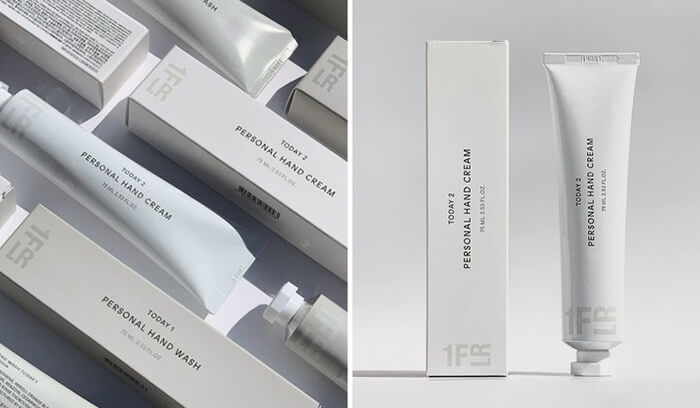
Top 10 Creative Cosmetic Packaging Design Ideas & illustrations 2023 | Luxury-Paper-Box.Com
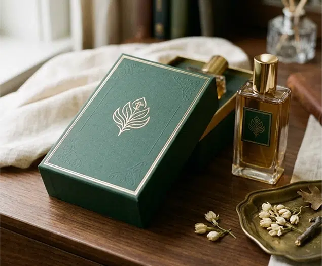
How the Right Perfume Packaging Sells the Scent
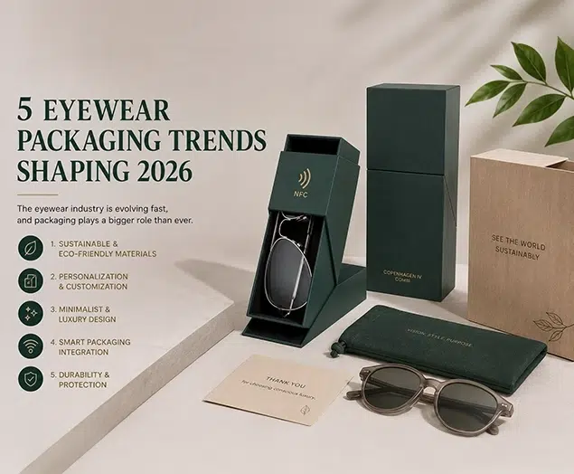
5 Eyewear Packaging Trends Shaping 2026