LOGO Design Guide – 7 Tips To Improve Your LOGO Design
In terms of the cost-effectiveness of design, it is quite high to do LOGO. It is not a new thing to sell a small LOGO for a huge amount. Of course, only the designer knows that it is not easy to do a good job with this seemingly simple design. Today, we want to share with you 7 concepts that will make you a better designer. We’ve selected three LOGO critiques, each one will relate to one of these concepts. Let’s in-depth at these best 7 LOGO design concepts and how to use them to prove your design.
Logo Design Guide – 7 Tips To Improve Your Logo Design
Make a negative shape in the letters of the brand name
Since positive and negative graphics have their own artistic attributes, there are countless LOGO design cases using this technique. But today we just want to focus on one of them: making negative shapes in the letters of brand names. These letters can be the first letter of the brand’s English name or a combination of several letters. There are many such LOGO cases. Of the 26 English letters, except T, I, and L, almost all other letters are suitable for negative shapes.
Notes:
– The figures used for negative shapes must be concise. When letters or graphic elements are not suitable for positive and negative shapes, do not use this technique forcibly;
– Generally speaking, open positive and negative shapes look more comfortable than closed ones, which is related to the combination of specific letters and graphics. The series of LOGOs I listed above are open, while the coffee LOGO above belongs to semi open.
Stripe the figure
More frankly, it is the feeling of making characters or graphics into zebra stripes or zebra stripes. This kind of LOGO is characterized by beauty, a sense of design, and rhythm. Many classic LOGOs use this technique.
Notes:
– No matter whether your LOGO is a text or a graphic, you should determine the general contour before striping, and then turn it into a striped graphic on this basis.
– The specific stripe type needs to be determined according to the brand tonality and the external contour of the figure;
-The text or image must be recognizable when using this method.
Point out the figure
It is also a common way of expression in LOGO design to use points to make a figure. In addition to the beautiful form, the combination of multiple points is very dynamic and has many meanings.
Notes:
– The outline of the dot graph should not be too complex, or there will be problems in the recognition;
– When arranging points, pay attention to the distribution of size and density. According to the relationship between points, they can be divided into gradual, unified, superimposed, separated, 3D, free, and so on. They should be selected according to specific needs.
-Such signs will be very tragic if they encounter customers who suffer from an intense phobia-
Add round
I don’t know if you have noticed that many signs like to apply circles directly, which is different from turning figures into circles. This method is simpler and rougher, that is, adding circles directly on the basis of the original figures or words. However, it is also very beautiful. Such signs are particularly common in the design of food brands. The reason should be that the circle is the most perfect figure, simple and beautiful, and the visual focus.
Incorporate arrow elements into the sign
Some people may think that this is a kind of skill. Isn’t the integration of a certain element into the LOGO determined by the product category, brand tonality, and concept? This is true for ordinary graphics, but the arrow symbol is an exception, and the arrow element is very plastic, which can be integrated into almost any graphics and text, so we can see that signs with arrow symbols are all over the industry.
Notes:
The arrow symbol tends to be rational and masculine, so it will be more appropriate to use it in the corporate LOGO design or in the LOGO design of electronic, technological, and industrial brands;
Broken
That is, to create a sense of breaking through the shackles on the graphics. Such a sign has the characteristics of sharp contrast, strong visual impact, and dynamic feeling, so it is also a skill often used by designers
Notes:
When using the “breaking” technique, we should consider the possibility of the LOGO’s application in practice. If the effect is too complex, it will cause a lot of trouble for offline production, so we should avoid making mistakes.
Golden section method
The golden section is a word often mentioned in the design circle, which has a certain role in standardizing graphics. It is said that the graphics that conform to the golden ratio are the most beautiful. It is also said that the gods of design love to use it. For the sake of these awesome “it is said”, the skills of using the golden section line must be mastered. Besides, there are indeed many excellent signs that use this skill.
Notes:
– Not all graphics are suitable for design with the golden section method, so they cannot be mechanically copied;
– It is not that a figure that conforms to the golden ratio is necessarily beautiful. It can only be used as one of the aesthetic basis and design techniques. Moreover, due to different specific usages of the golden section, the final results will be very different. In short, good aesthetics is the key to success.
Top 10 Creative Cosmetic Packaging Design Ideas & illustrations 2023 | Luxury-Paper-Box.Com

Top 10 Packaging Design Trends for 2026
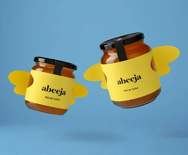
30 Honey Packaging Designs That Capture Nature’s Sweetness

Why AI Packaging Design Makes Your Brand Faster

How Cookie Packaging Brings More Charm to Your Brand
