

Top 10 Most Creative Pharma Packaging Designs 2023 | Best Pharmaceutical Packaging Ideas
In the world of pharmaceuticals, the packaging is more than just a way to contain and protect medicine. It has the power to make a product stand out on crowded shelves, provide critical information to patients, and even improve the user experience. As the pharmaceutical industry continues to grow and evolve, so too do the demands placed on packaging designers. From innovative materials to bold graphics, the top creative pharmaceutical packaging solutions of today are both beautiful and functional. In this article, we will explore the top 10 creative pharmaceutical packagings that are making waves in the industry.
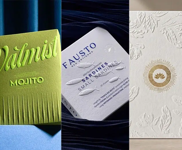
Top 10 Most Creative Pharma & Drug Packaging Designs 2023
As a product strictly controlled by the government, pharmaceutical packaging design requires clear information transmission and practical value, such as product protection and a good user experience. The main function of pharmaceutical packaging design is to protect the medicine and make it more convenient for pharmacists and consumers to use. Therefore, information dissemination must comply with national regulations and be clear and accurate. In addition, due to the serious homogeneity of pharmaceutical packaging design, designers often create typography, patterns, and colors to better differentiate the products and make them stand out. Here, we bring you 10 of the most creative pharmaceutical packaging design cases, hoping to provide you with more design inspiration.
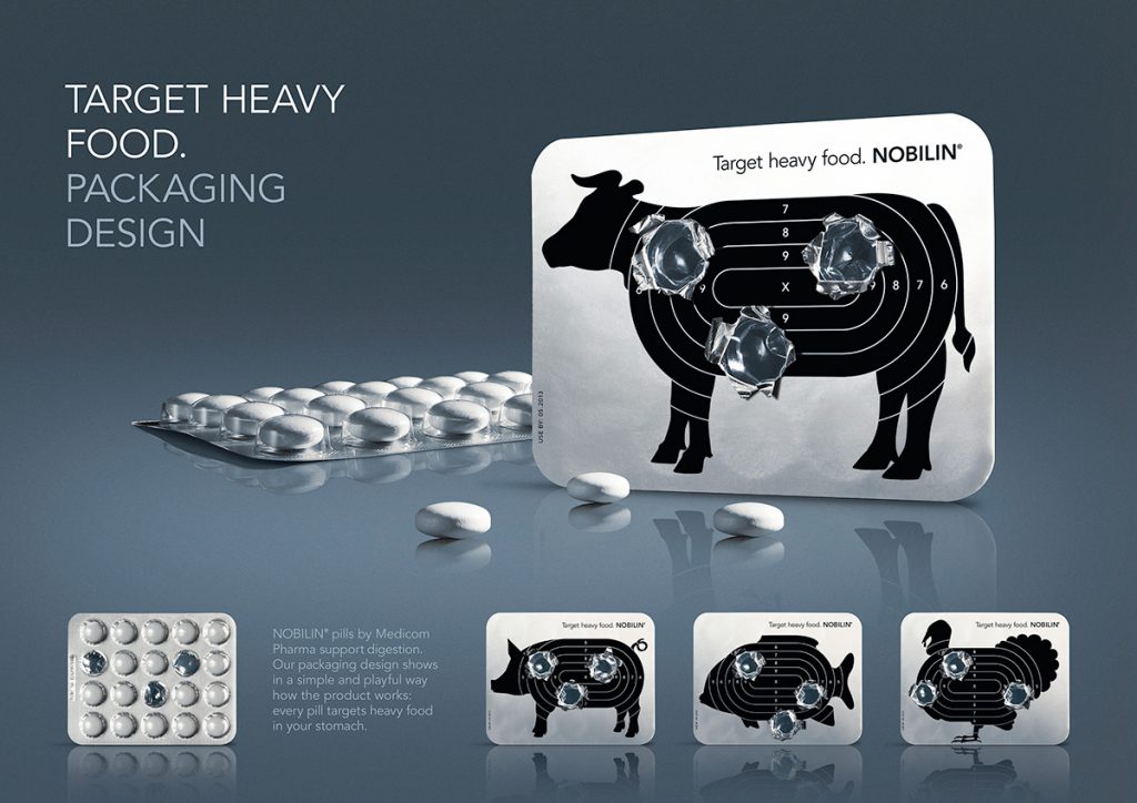
1 – NOBILIN consumer drug packaging
NOBILIN is a drug focused on consumption, German designer Daniel Schweinzer has done an interactive creative packaging design for it, in the pharmaceutical packaging design Daniel Schweinzer with a variety of animal silhouettes as a creative idea, used to represent indigestible meat food, and the gun target position combined in the silhouette, the overall graphic is presented on the aluminum foil plate of the drug, when the patient uses the drug will open the aluminum foil plate, And leave a mark on the foil plate because it leaves a lot like a gunshot when taking the medicine (representing the elimination of food), making the package highly participatory and interactive.
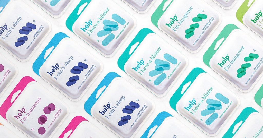
2 – Help capsule pharmaceutical packaging
Phillipfivel from New York is a world-renowned design team that covers product industrial design, packaging design, brand design and other fields, among which help capsule pharmaceutical packaging design is one of its many representative works. As we all know, most of the packaging of capsule drugs is a large-volume box, but in the terminal sales display of this box not only occupies space and is not convenient for consumers to carry, and at the same time often appears that the purchased drug is not taken and causes waste, help capsule drugs also face such a problem, so Phillipfivel design team breaks the convention of capsule drug packaging design, the packaging is designed as a small volume can be hung display form, In the material process of the packaging, uses environmentally friendly pulp and sticker tearing, while the form of the drug itself as the main visual graphic of the packaging to facilitate consumption identification, the new packaging after the launch with its design in all aspects of innovation and similar competitors have obvious differentiation, laying a good foundation for brand communication and product sales.
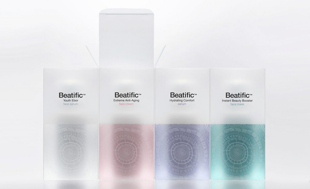
3 – Beatific cosmetic packaging
Beatific is a cosmeceutical brand from Greece, and the brand’s product packaging is made by Mousegraphics, a well-known Greek design team. The cosmeceutical product is mainly aimed at the high-end female market, and the product development is completely based on clinical medical research and positioned in high-end healthcare cosmetics. The Mousegraphics team combines the abstract sun pattern and the annual ring pattern as the creative visual symbol of the product packaging, symbolizing the two concepts of health and age, and presents four elegant colors in the translucent PVC material on the packaging material, making the overall packaging design both mysterious and high-end.
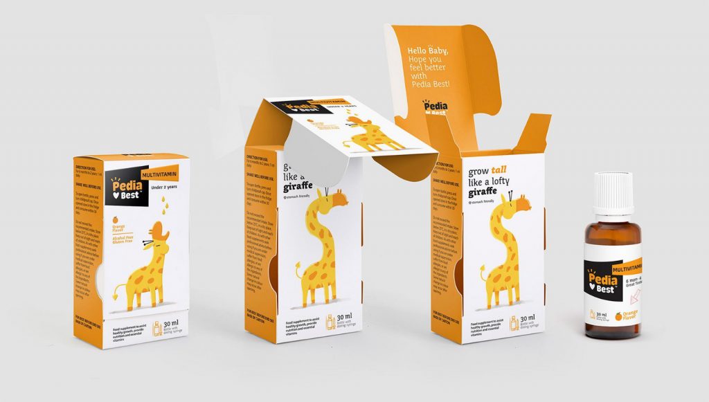
4 – Pedia Best children’s pharmaceutical packaging
Resistance to medication is a common trait in many children, so one of the best and most effective ways designers came up with to entertain children is to tell stories with animals as characters. This helps the mother to feed and give medicine to the child easily. The original idea behind this children’s pharmaceutical packaging design was inspired by flipbooks and children’s lift-the-flap books, with the aim of creating curiosity and familiarity for children and getting them interested in the content. In addition to the structure of the package and the visual elements above, it helps mothers tell stories and entertain their children by showing them pictures.
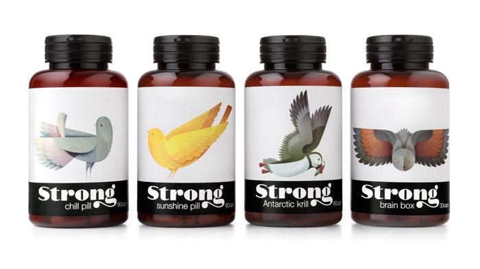
5 – Strong nutraceutical packaging
Pearlfisher from the United Kingdom is a world-renowned packaging design team, of which Nongfu Spring’s oriental leaf packaging design is Pearlfisher’s work, and Pearlfisher’s representative work is the packaging design of strong nutritional health products. In this project, Pearlfisher takes birds with various hidden meanings as the main visual graphics, such as the meaning of the owl is wisdom and intelligence, the canary means sunshine and health, reflecting the function of the product, while the similar competitors have obvious visual differentiation in the terminal sales channel, which provides the possibility for brand communication and product sales.
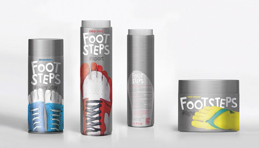
6 – FootSteps spray pharmaceutical packaging
FootSteps concept spray pharmaceutical packaging design by Russian designer Yuliana Mychko, FootSteps products have the effect of removing odors, so the idea of the packaging focuses on the functional characteristics of the product, using all kinds of shoes as the main graphics of the package. Embodiment: The concept of feet in breathing has obvious visual differences with similar products, and also has a strong visual recognition symbol function.
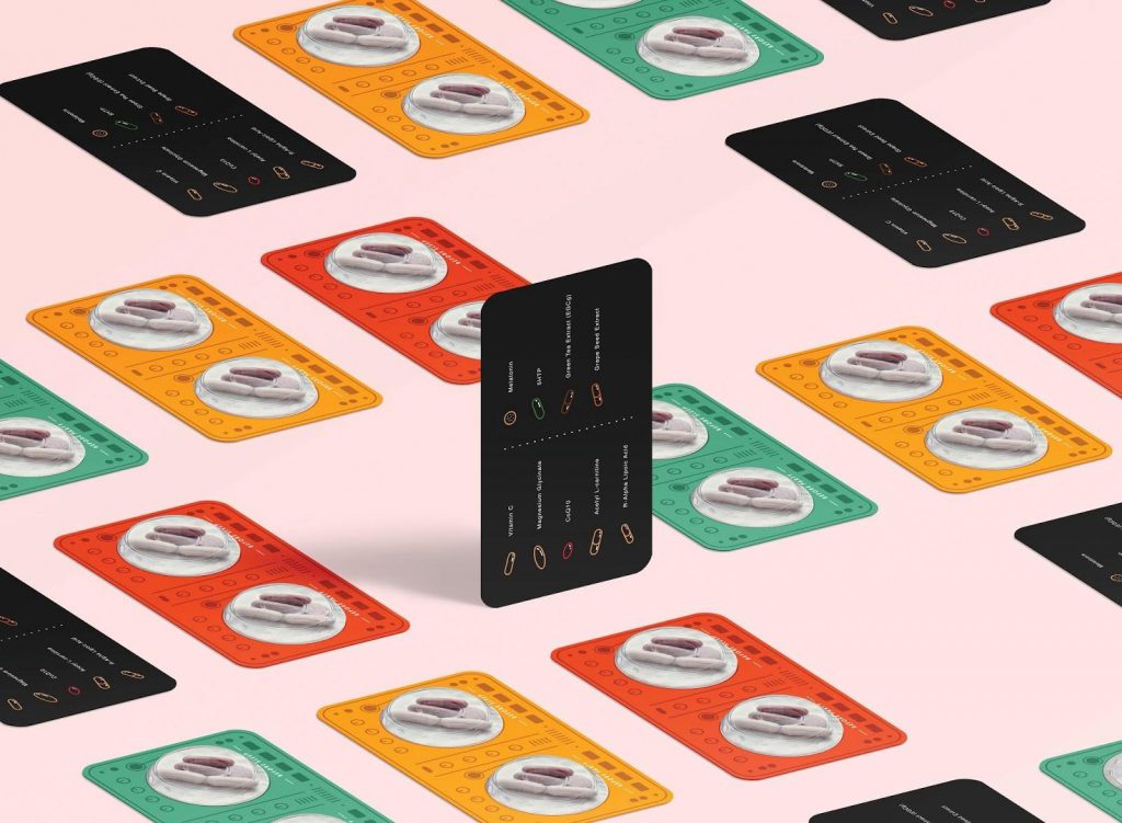
7 – Rave pack vitamin pill packaging
The Rave pack launched by a pharmaceutical company in the United States is a nutritional supplement and vitamin pill created for the subdivision of young people’s gatherings, which can enable young people to maintain more physical strength at the party and get a better rest after the party. When faced with a product that looks no different from ordinary pills, the designers subversively combined the elements of the DJ turntable to give the product a themed design language. While adding fun to the product itself, it also successfully captures the attention of target consumers.
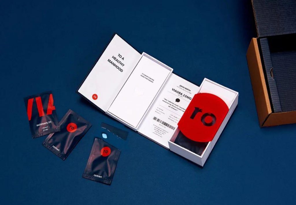
8 – Roman Health men’s health pharmaceutical packaging
Roman Health, a men’s healthcare brand in the United States, provides a high-quality, secure brand experience for a product sold on its platform, with a refined and low-key appearance and a high value on patient privacy. Therefore, the packaging of this product is designed as a set of exquisite gift boxes, and as the gift box unfolds, the brand slogan and drug message are displayed in front of the patient’s eyes one by one. The instructions are designed in a modular manner according to the patient’s use process, and are arranged in the gift box in an orderly manner with the drug, so that the patient can understand the product more clearly. In addition, the packaging of the product subverts the public’s perception of drug packaging, which is more like a delicate digital accessory than a drug, and to a certain extent, it also alleviates the embarrassment that patients may have in the process of medication.
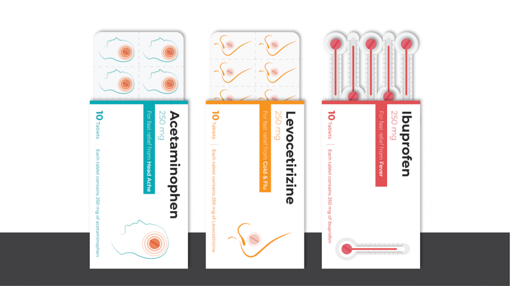
9 – Sim-Pill tablet packaging
The packaging project, called Sim-Pill, aims to make it easier for patients to identify the type of drug and the disease they treat. The designers designed their own graphic packaging for three drugs with different efficacy. In the first category, a headache-relieving drug, the designer combined an illustration image of the head with a pill and incorporated a tablet blister and carton design to visually indicate that the drug can treat migraines and other symptoms. For the second type of drug to relieve flu symptoms, designers concocted the same method, through the shape of the nose to show nasal congestion, a common flu symptom, so that patients can recognize the drug for influenza treatment at a glance. The third category is fever-relieving drugs, and the pill blister is designed in the shape of a thermometer so that patients can quickly identify the fever-reducing effect of the drug at first glance.
10 – Target Simply Balanced vitamin tablet packaging
The Target Simply Balanced vitamin tablet package, developed by TricorBraun, provides operational efficiency for a new premium nutraceutical product with child-safe and age-friendly features. The standard-sized single-bottle and closure design simplifies the manufacture and storage of packaging components. This bottle has a rectangular appearance and is more recognizable compared to competing products on the shelf. Rectangular packaging is more space-efficient than round packaging, increasing storage, distribution, and sales efficiency. The bottle opening is designed to be wider than the normal bottle opening, which makes it easy to fill vitamin tablets quickly and hygienically. The transparent bottle allows consumers to see the contents before they buy and can observe the remaining amount of the contents at any time during use. Color-coded labels and caps make it easy for consumers to identify different types in Target Simply Balanced’s line of vitamins.

Top 10 Creative Cosmetic Packaging Design Ideas & illustrations 2023 | Luxury-Paper-Box.Com
How the Right Perfume Packaging Sells the Scent
5 Eyewear Packaging Trends Shaping 2026